Ron Stocke Workshop Review

Watercolor painting of campers around a campfire underneath tall fir trees
My copy of Ron’s demo painting

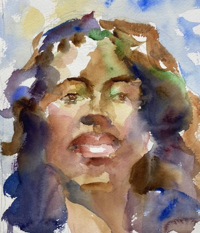
Ron Stocke is one of the premier watercolor artists I admire, so when I got a chance to register for his two day workshop at Cole Gallery in Edmonds, I signed right up. Ron’s style is loose and impressionistic, with glowing colors and beautifully blended washes.

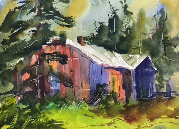
Ron, who is in his fifties, has painted since childhood. He has an architectural background and loves to paint buildings and cityscapes. He paints with layers of washes. In the first wash he paints in the background sky, distant objects, and foreground. He lets this dry, then he paints the middle ground with its darker values. Then he paints the area of dominance with the dark details, and lastly adds the finishing touches.

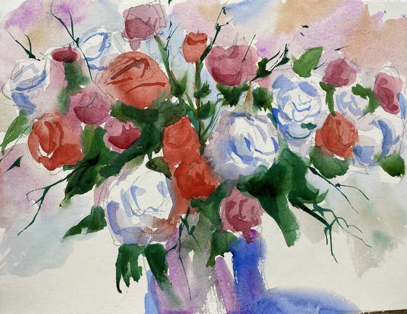
He connects the objects of the painting so that there are many soft edges , and he uses light and shadow with dramatic effects. I especially like the way he combines colors on the paper and often adds water to make the pigments flow and blend.

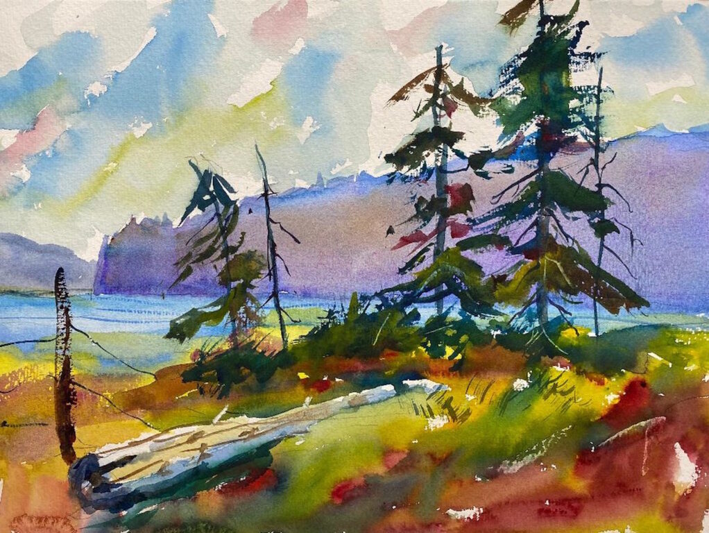
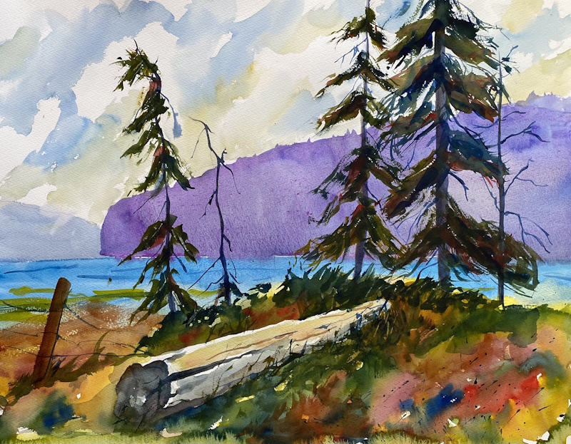
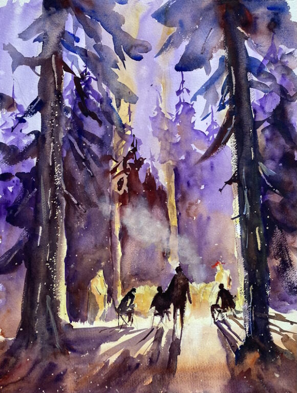
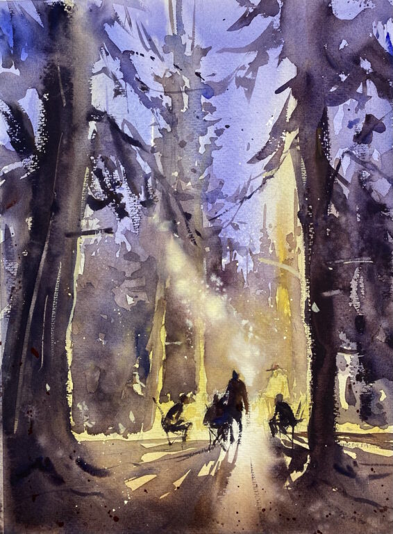
On the first day, about twelve students and Ron met in the basement of Cole Gallery, a rather cozy space. Ron painted a demo of a campfire in the forest at night (below). He painted the first wash, then he let us try it. Then he painted the second wash, explaining as he painted, and we went back to our easels to copy him. Same with the third wash and the details.

I was pretty pleased with my effort. It’s pretty easy when everything has been decided for you and you have a finished painting to copy. All you have to do is replicate what the teacher has painted. I learned a lot watching Ron at the easel as he mixed his washes in the palette and loaded his brush with paint. I was impressed with Ron’s brushes, especially the DaVinci Maestro #12 and #14 brushes. They hold a lot of water and have a beautifully pointed tip (they’re also very expensive!).

Ron Stocke campfire demo

Later in the afternoon, he painted the first two washes of a pond with ducks on it. I think we were all getting tired, so he wrapped it up before we got a chance to paint.

The second day of the workshop was a Sunday, and I felt strange not preaching a sermon in church. My agreement with the church is that I have four Sundays a year off, but still it felt odd. We started earlier so that we could leave in time to watch the Super Bowl. Frankly, I don’t care whose billionaire owner with a bunch of high-paid gladiators beats the other owners’ high-paid gladiators, so it was all the same to me.

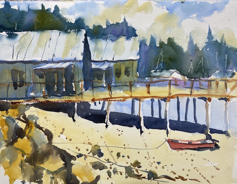
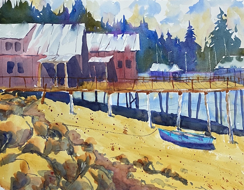
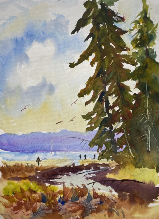
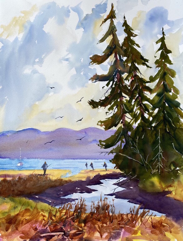
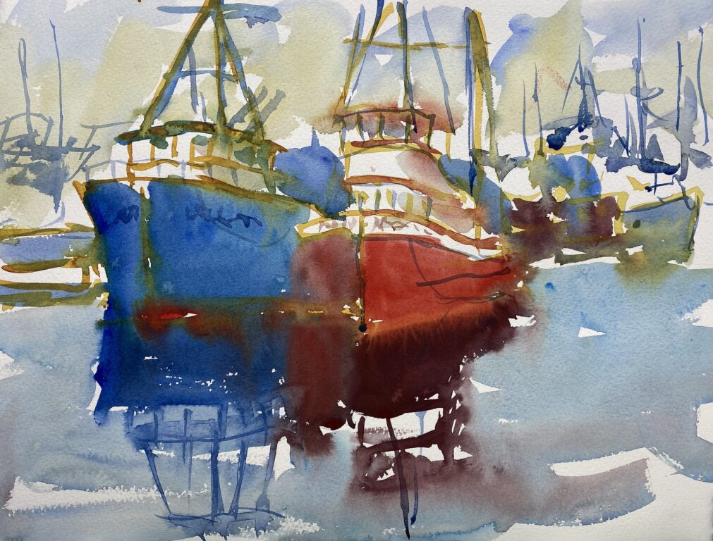
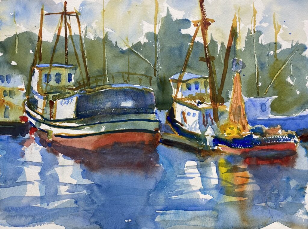
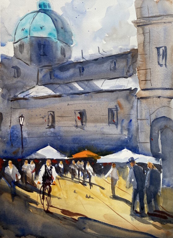
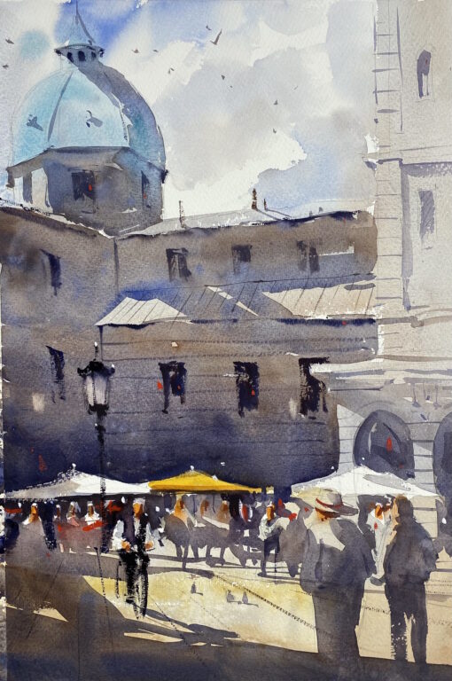
Ron painted a beautiful scene of a plaza somewhere in Europe. He painted the first two washes, explaining as he painted, and then we tried it. I wasn’t as able to replicate his washes, probably because I was tired from the first day, but I learned a lot. Here is my effort, with his beautiful painting below mine.

Watercolor painting of campers around a campfire underneath tall fir trees
My copy of Ron’s demo
Watercolor painting of a plaza in Europe with pedestrians and a bicyclist
Ron Stocke plaza demo

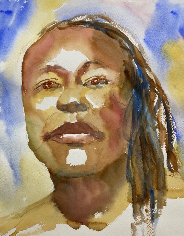
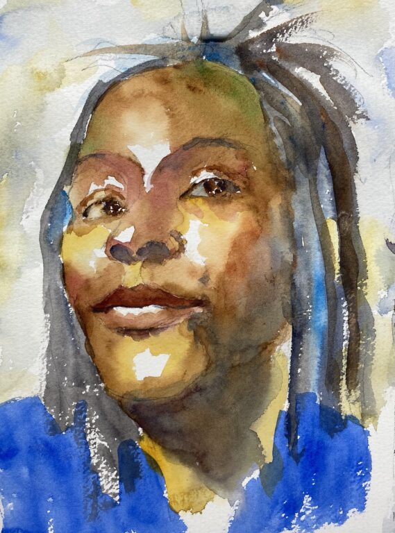
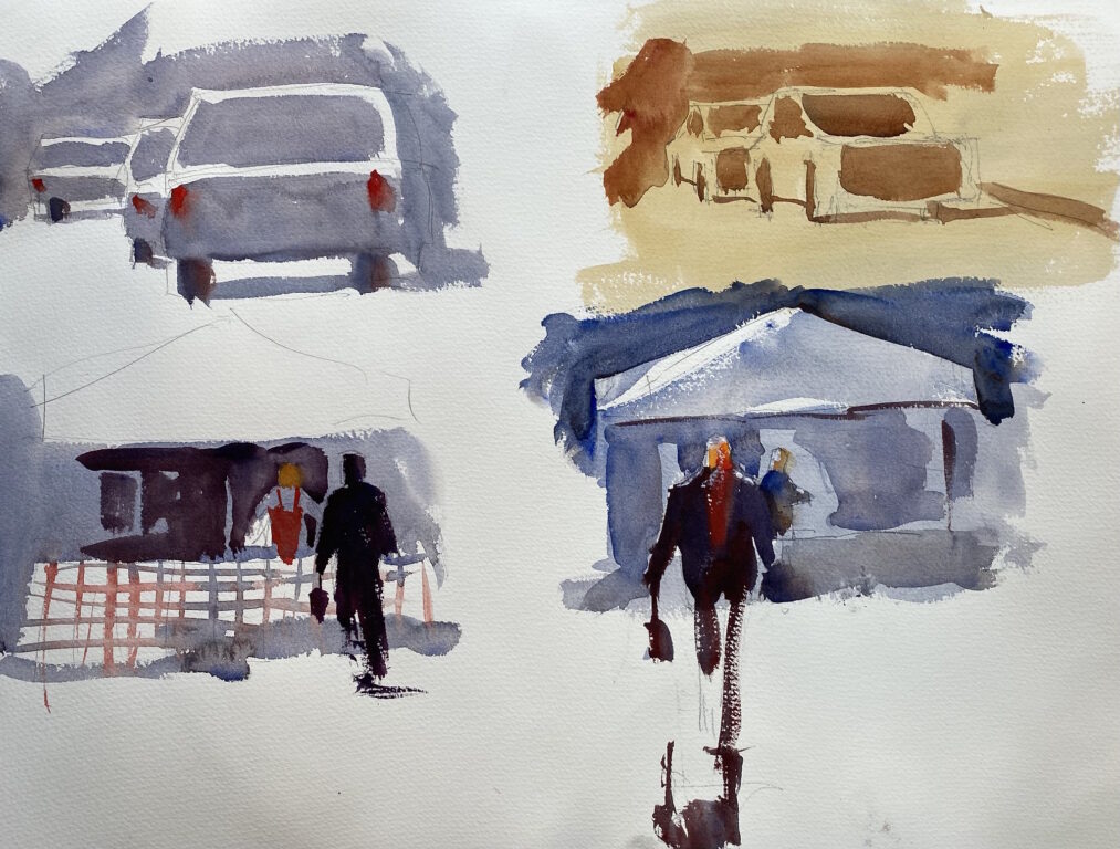
Near the end of the workshop, Ron showed us how he paints human figures and cars. He showed us his sketchbook, in which he works out the composition of his paintings. Some of his sketches are worthy of being framed.

Watercolor sketches of figures and cars
My copies of Ron’s sketches

I feel I learned a lot from Ron’s workshop. He’s very encouraging, going from person to person to offer suggestions on their level. He’s very positive and an enthusiastic champion of watercolor painting. I think my personal style of painting is a little looser and more colorful, but I appreciated learning from Ron.

Ron Stocke Workshop Review Read More »

Roses are red

a watercolor painting of red and white roses. Roses are red.

Roses are red, but I have shied away from painting flowers because they have their own demands. All those petals and subtle colors. But I would like to paint flowers, so I made this painting to practice.

The important thing in flowers in watercolor is to let the colors flow into each other. Let the flower shapes be part of a whole instead of separate, individual flowers. I did this by lightly misting the paper before I began so that the edges softened slightly and merged the flowers.

Another goal for painting flowers is to group them in interesting shapes. Don’t let the bouquet become too symmetrical, but let it have a pleasing shape overall. I’m fairly happy with my roses in this painting, but I would like to have more variety in the greens.

Roses are red Read More »

Looking back on 2025

An abandoned cabin in the woods

As I look back over the paintings I made in 2025, I can see some progress. The main thing I learned is this: use more paint and use more water.

When I’m stingy with paint and water, my paintings look scratchy and unconvincing. When I’m generous with the paint and water, they look robust, fluid, and unified.

A lot of this is confidence. When I’m confident, I use big brush strokes, lots of color, and big shapes. When I’m tentative, I paint in the outlines and fuss over details. I’m beginning to understand what it means to paint with confidence. The more I paint, the more confident I become, so my goal is to put in lots of brush hours in the coming year.

As I review my 2025 paintings, I notice that I produced better and better paintings as the year went on. A turning point was the two days in September when Katy and I went to Centralia, WA, for Katy to attend a writer’s conference. While she was at the conference, I painted barns in the surrounding area, and for some reason I seemed to loosen up and let the paint flow.

In January and February, I concentrated on portraits. I painted over 60 watercolor portraits and improved my skills. I still have a long way to go, but I’m pleased with the progress I’ve made.

In March, I took a watercolor workshop in Long Beach, WA, with my teacher, Eric Wiegardt, and in July I took another workshop with him. Both workshops were stimulating and helped me loosen up. Watching Eric paint with abandon is a joyful experience. In addition, I had a lot of fun with the other watercolor artists attending the workshop.

In April, I was accepted into Pacific Northwest Plein Air at Columbia Gorge. For four days I painted scenes in the gorge along with about 40 other artists. At the opening reception I was very impressed with the quality of the other painters, many of whom were extremely talented. I’ve been invited again this year.

I attended a number of plein air outings with Northwest Watercolor Society and Plein Air Washington Artists, and I enjoyed the camaraderie. A bonus for me this year is that my son, Guy, is starting to paint watercolors alongside me. He’s actually very good, even though he’s just a beginner, and it’s fun to watch him grow as a painter.

In July I was the facilitator for a PAWA paintout at La Push, on the coast. I enjoyed being with the other painters as we attempted to paint the dramatic scenery at the coast. In August I attended the Whidbey Island Plein Air event for the third year in a row. I especially enjoy painting the scenery near Coupeville.

In September, I traveled to Los Angeles, where one of my paintings was featured in the Watercolor West show at the Hilbert museum. It was humbling to see my painting among such distinguished art works when I attended the opening reception.

I December, I was the featured artist at a Poulsbo Artist League show at Treehouse Cafe on Bainbridge Island. I worked hard to assemble thirteen paintings, frame them, and hang them for the reception. It’s been very rewarding to see all my paintings in one place and hear comments. In addition, I sold four paintings. I hope the new owners enjoy their paintings for many years to come.

2025 was a good year for watercolors. Here’s to another good year in 2026!

Looking back on 2025 Read More »

Watercolor portrait of Gloria, aka Queen Nefertiti

watercolor portrait of a black woman

One of our favorite models at life drawing group is Gloria, also known as Queen Nefertiti. She has a regal bearing and a striking face. I made this watercolor during a twenty-minute pose. I began with the eyes and then moved to the forehead and worked down the face from there. I used the method taught by Charles Reid: place the color with the brush, then soften it. I made sure to vary the color. It’s important, especially with a dark complexion, to add more color into the skin tones. Here I added red in some places and a touch of green in other places. Pretty happy with this portrait.

watercolor portrait of a black woman

I painted this portrait of Gloria from a photo. I kept it pretty loose, using a lot of paint and water on my brush and letting the washes mingle. I left some areas white to show the highlights on the skin.

watercolor portrait of a black woman

This portrait is a copy of a portrait of another model by Annette Smith. I took an online course from Annette last winter, and I admire her portraits. I was able to keep a lot of soft edges in this portrait, and I like the greens, reds and blues in the skin and hair.

Watercolor portrait of Gloria, aka Queen Nefertiti Read More »

Featured Artist at art show opening

Last Sunday was the opening reception for an art show in which I was the “featured artist.” It was a joyous affair, with many friends and colleagues coming by to see my paintings and offer support. Katy and Guy were there, helping me with the logistics. For me, it was very affirming and encouraging. I’m grateful to everyone who made the show possible and to everyone who came.

Here are the thirteen paintings I entered in the show, basically the best of my work over the last year. The show is sponsored by Poulsbo Artists League (PAL), of which I’m a longtime member, and it’s hanging at the Treehouse Cafe on Bainbridge Island through February. As the featured artist, I got to hang my paintings together in the large dining room. I really liked seeing all my work in one place because it highlights my painting style.

Kay Boyce, president of PAL, was instrumental in organizing the show and helping me with the hanging. Many friends from PAL came to the opening, as well as my friends from my life drawing group. It was an extra bonus to sell three of my paintings at the opening

I’ve been preparing for this show for weeks. First I made eight picture frames to add to the five I already had. I cut the poplar, stained it, varnished it, stapled it together, and cut the glass and mats. Then I made sure all the paintings were signed and created an identifying card for each painting. And Guy and I transported the paintings to the show and hung them (without breaking the glass in any of them!).

Featured Artist at art show opening Read More »

Supersize that painting

Recently I entered several paintings for selection in the Cole Gallery show in Edmonds, WA. They encouraged artists to submit smaller plein air paintings along with the same subject painted in the studio in a larger size. So I took some of my quarter-sheet paintings (11 by 15 inches) and painted the same subject again in a larger size, 16 by 21 inches. Here are the results in comparable sizes. Do you think that the larger paintings, which were painted more slowly and leisurely, are better than the smaller paintings, which were done quickly?

The first pair are paintings of Port Orchard Railway Marina. The buildings on the dock are actually green, but I changed them to red in the larger painting because I thought it would make a better contrast with the trees behind them. Oddly, I felt freed up as I painted the larger paintings, perhaps because I had more room on the paper to express the subject.

Port Orchard Railway Marina 11 x 15 inches
Port Orchard Railway Marina 16 x 21 inches
North Bay tree island 11 x 15 inches
North Bay tree island 16 x 21 inches
Plein air painting of Chico Creek, 11 x 15 inches
Studio painting of Chico Creek 16 x 21 inches

Supersize that painting Read More »

Boats Boats Boats

Two boats at Fishermen’s Terminal in Seattle, from a photo

Last week I focused on painting boats. Boats are great subjects because of their compound curves, their watery settings, their big shapes, and their delicate rigging. A boat has a purpose, whether its fishing or sailing, and that comes out in the painting. I painted these two boats from a photo, trying to keep them loose and wet so the colors would merge. I started by painting the outline of the boats in yellow, then I used a big brush and lots of paint to lay in the big shapes of the hulls, painting right down into the reflections all in one wash. I finished up with the rigging and a few vague indications of other boats in the marina. This is the way I’d like to paint boats.

Plein air painting of boats at Fishermen’s Terminal

On Wednesday, my son Guy and I took the ferry to Seattle and joined other painters with Northwest Watercolor Society at Fishermen’s Terminal. There are hundreds of boats to paint, of all sizes and shapes; a painter’s dream. These two boats caught my eye so I set up my easel and went to work. I like the painting, especially the blue boat, but I think I got too caught up in the details. Still, I like the way the eye goes to the boathouse on the right. When we finished, we joined about twenty other painters to show our paintings to one another.

F/V Karolee at the Port Townsend marina

On Thursday I drove to the Port Townsend marina and boatyard that is chockablock full of boats. I picked out these two vessels and started to paint. At noon I took a break for a bowl of chowder at Sea J’s Cafe, a lowbrow cafe a few steps away with homemade tables, faded bumper stickers on the wall, and one hardworking young woman acting as cook/server/dishwasher/cashier. The chowder was delicious; lots of clams and bacon.

With a cup of hot tea supplied by my thermos, I finished my painting. It wasn’t bad, but I thought I could do better, so I painted a second version that you see here. I like the shape of the Karolee and the focus on the white cabin, and the reflections aren’t bad. But I got balled up on the details again. It’s so hard to simplify.

When I finished, I showed the paintings to the young woman in the cafe, and she approved of them. Taken altogether, I’m pretty happy with a week of painting boats.

Boats Boats Boats Read More »

Our annual stay at Lake Crescent Lodge

Lake Crescent Lodge at Olympic National Park

Last week Katy and I stayed at Lake Crescent Lodge. It’s our fourth year to enjoy the historic old lodge, the fall colors, and the cool, rainy weather. We especially like the evenings, when we curl up in the sofas in the big lobby. The roaring fireplace, dark beams, and friendly atmosphere with other guests make it a favorite for us. A plaque says that FDR stayed here in the 1930’s, and it looks little changed since then.

In the morning we ate a leisurely breakfast in the dining room that looks out on the lake. Afterward, Katy took a long exploratory walk along the lake while I painted a watercolor of the lodge. This painting carries good memories of our stay.

Our annual stay at Lake Crescent Lodge Read More »

When is a painting finished?

Skokomish River barn, with improvements

When I finish a painting, I take it back to the studio and critique it. Does it need something more? Should I try to touch it up?

It can be dangerous to fiddle with a painting. Often you only make it worse with additional brush strokes. Besides, you lose the spontaneity of the fresh painting. But sometimes it can be helpful to make improvements. In this case, I brought my plein air painting (below) to the group critique with my teacher Eric Wiegardt. He said that I had a split area of dominance and suggested that I darken the sky and the shed on the left side of the painting in order to bring the eye to the barn on the right. Compare this with the improved painting (above) and see what you think.

Skokomish barn, first version

When is a painting finished? Read More »

Keeping it loose in Port Orchard

Marina in Port Orchard

Last summer I prowled the marinas of Port Orchard, a waterfront town on Sinclair Inlet. I took lots of photos and today I painted this watercolor. I like the looseness of the brush work and the general composition. The dark shadow under the dock is a main feature of the painting, leading the eye from the boat up to the building on the dock. The buildings were green, but I wish I had made them a different color to set them apart from the trees in the background.

I painted this watercolor while I was at the weekly meeting of Poulsbo Artist League. About fifteen of us meet each Wednesday afternoon in the parish hall at Vinland Lutheran Church near Poulsbo. It’s a chance to be with other artists and get some art work done at the same time. I’ve been a member for over fifteen years, so I know the other artists well. We are (you might say) mature artists, the average age being well over seventy five. These are my painting buddies.

Keeping it loose in Port Orchard Read More »