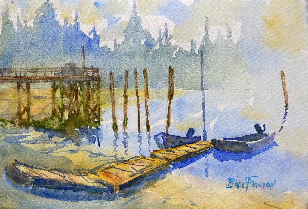
A good day of painting in Seattle
Last Wednesday I took the 7:20 am ferry to Seattle so that I could paint with members of Northwest Watercolor Society (NWWS). This group meets at paint-worthy locations every Wednesday to paint together and share their work.
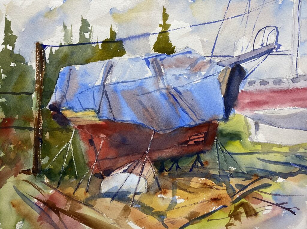
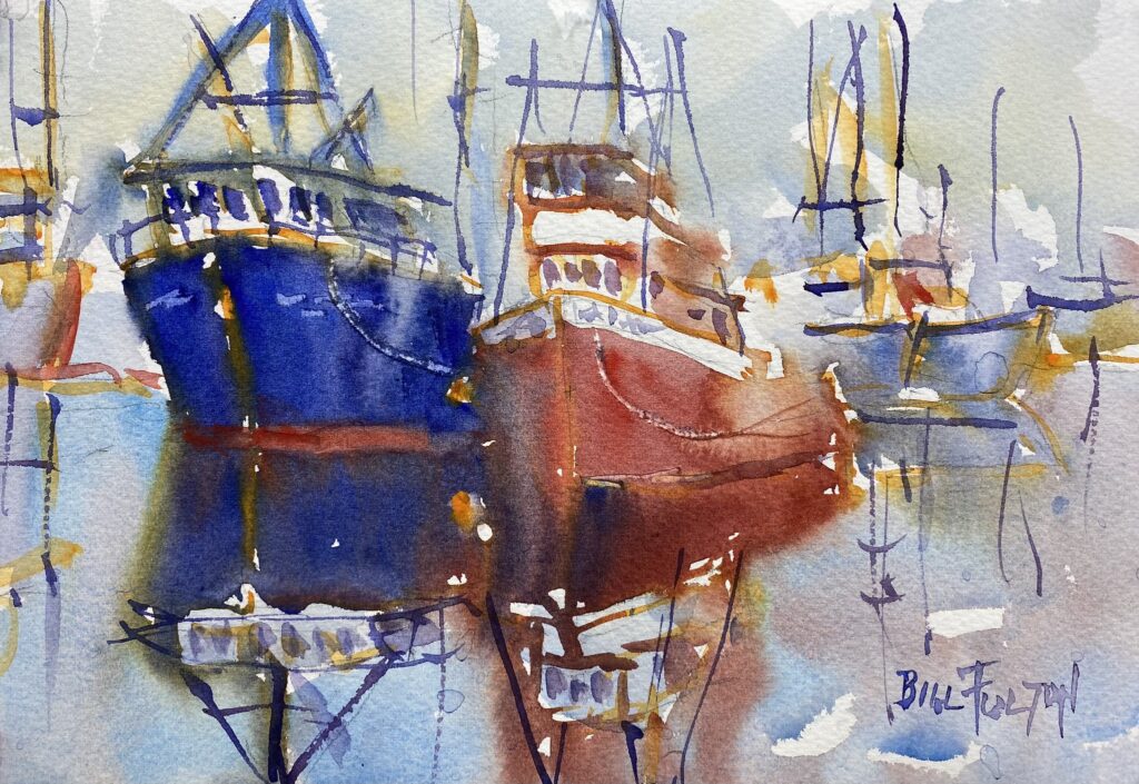
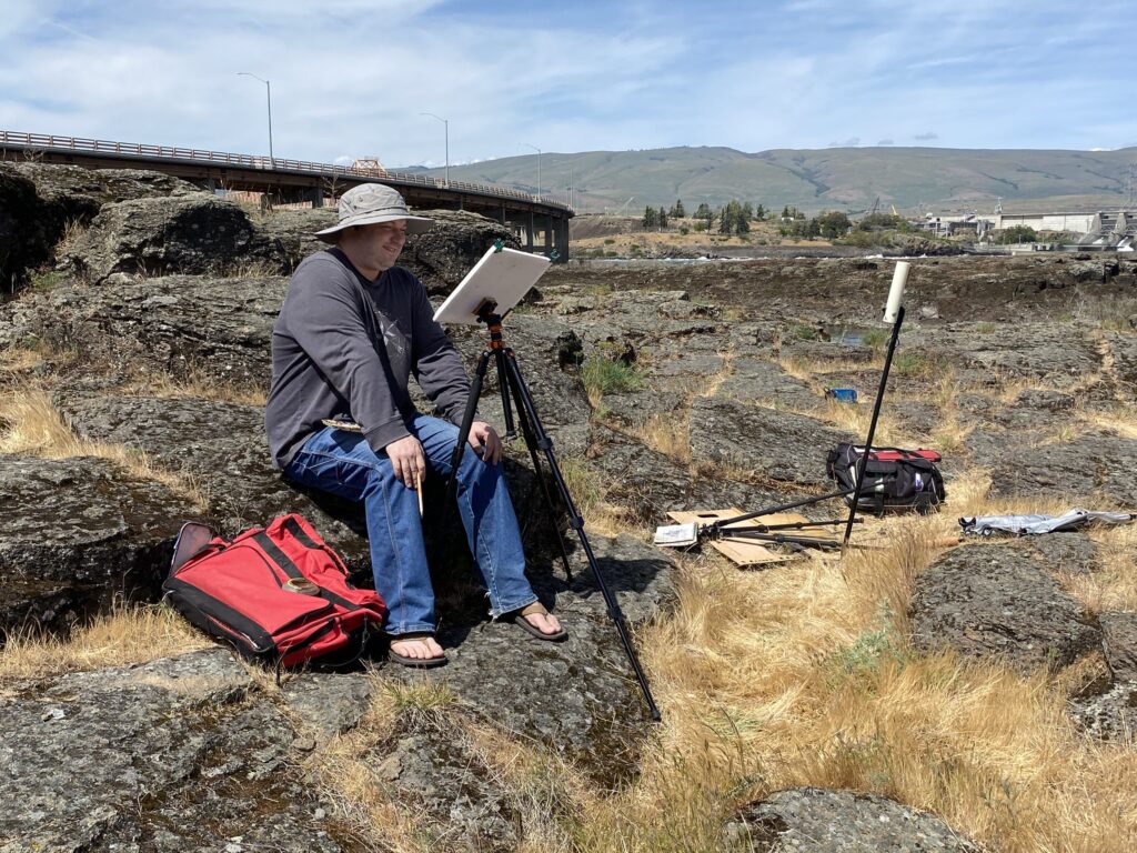
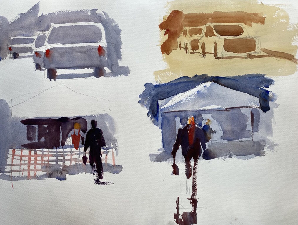
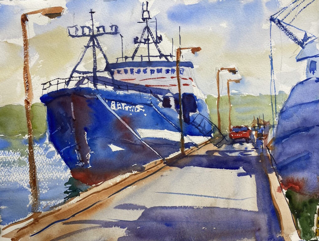
I arrived in Seattle at 8:20 and drove to Fishermen’s Terminal to get in a painting early in the morning. I strolled the docks and found a row of big fishing boats, including the F/V Baranof. There was a big shadow from another boat, so I set up my easel and made a pencil sketch in my small (5 by 8) sketchbook. I always make a pencil sketch first so that I can get the composition right and establish the values of the painting.
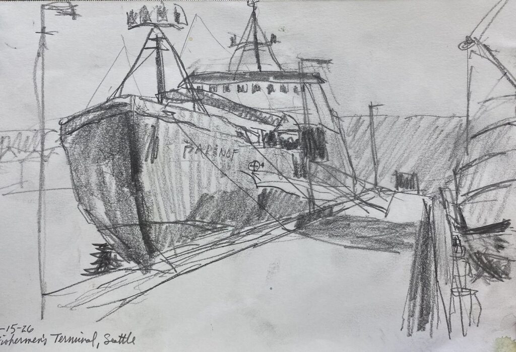
In this case, the dock naturally led the eye toward the boat, and later on a red pickup truck conveniently drove up and parked next to the boat. Nice subject! After I drew the shapes of the boats and the dock, I used the flat of the pencil to show how dark each shape was. The shaded side of the boat was very dark, and the light side of the boat was very light. Then I filled in the other values: somewhat dark, medium, and somewhat light.
Next I drew the composition on my watercolor paper and paused. The moment before picking up the brush is always a scary moment for me. What if I ruin it? What if I don’t know what I’m doing?
But I chase those thoughts away and make my first brush stroke. From then on, I’m in the zone. The painting unfolds as I go, and time seems to disappear as the painting overtakes me. I paint the boat hull, the opposite boat in shadow, the docks and the light poles. Then on to the surrounding shapes, finishing up with the rigging, the water, and the sky.
I was pretty happy with this painting. I think the mass of the boat attracts the eye and provides a good shape for the rest of the painting to relate to.
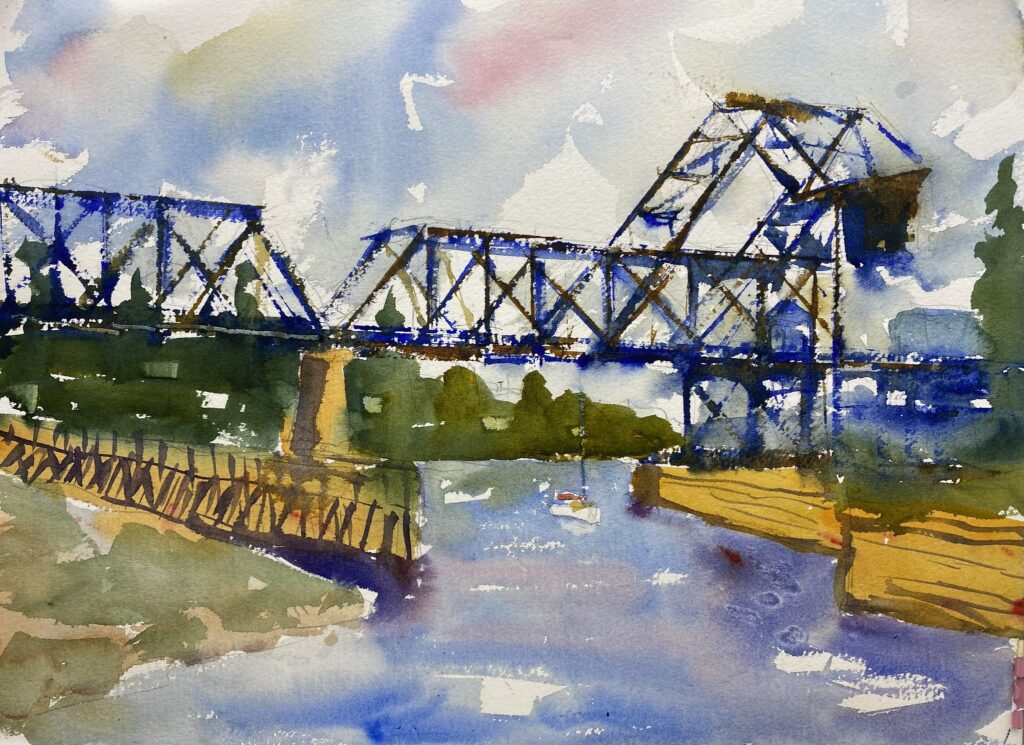
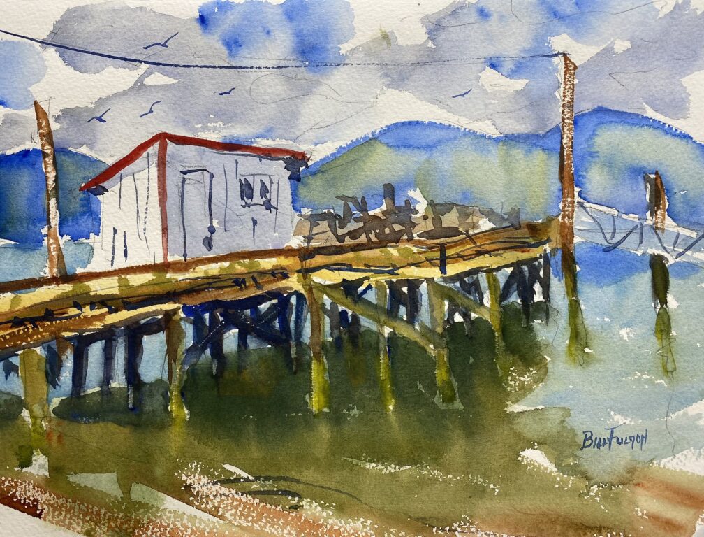
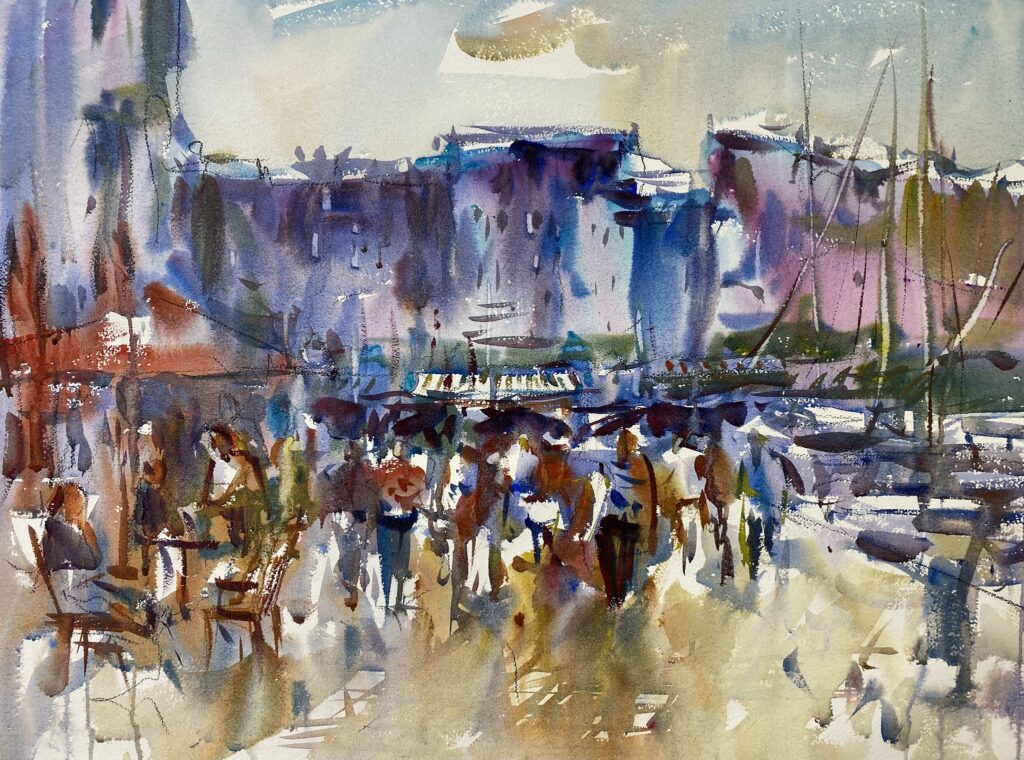
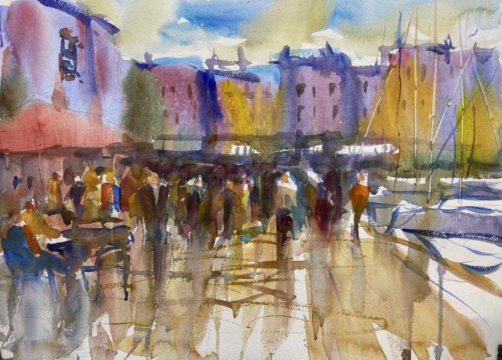
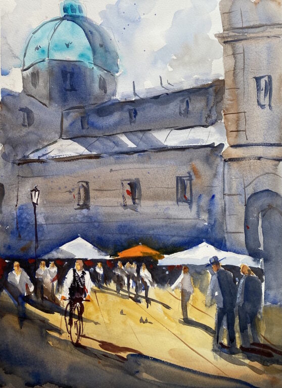
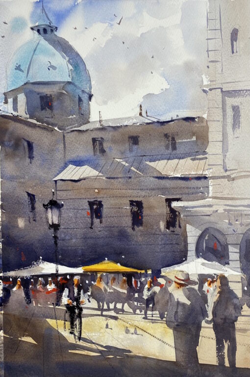
Then I packed up my gear and drove to Commodore Park, where NWWS members were gathering. Commodore Park is located alongside the Seattle Ship Canal, which provides a waterway from Elliot Bay (the ocean) to the fresh water of Lake Washington. Locks are provided so that boats can be raised or lowered to transit the canal.
It’s a beautiful location with lots of activity. Docktenders guide the boats that are entering or leaving the lock, and Seattleites of all descriptions are milling around the locks. Birds flit about, raccoons scurry on the shore, and an occasional seal can be seen in the water.
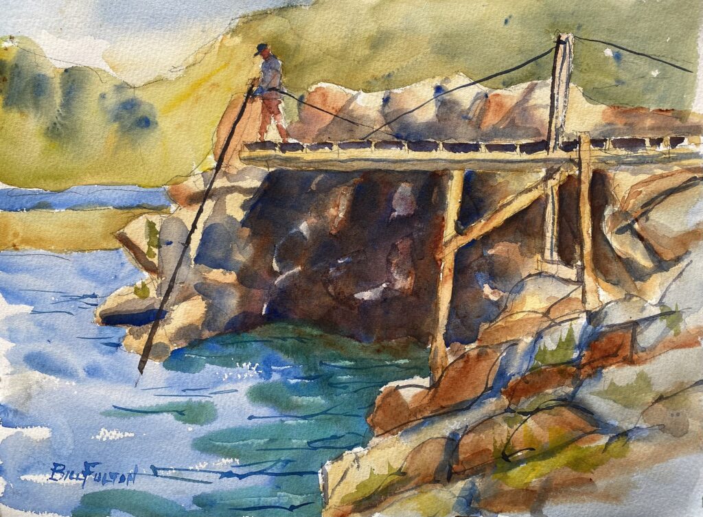
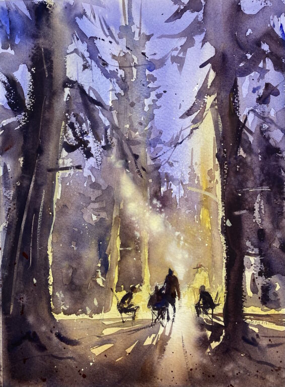
I scoped out the park and found a location alongside Diane, who had already started. I chose to paint the rusty old railroad bridge over the canal. I used an old credit card to paint the girders of the bridge. First I mixed up a good amount of paint in my palette, then I rubbed the edge of the credit card in the paint and applied it to the paper. The marks it makes are just right for girders and cranes.
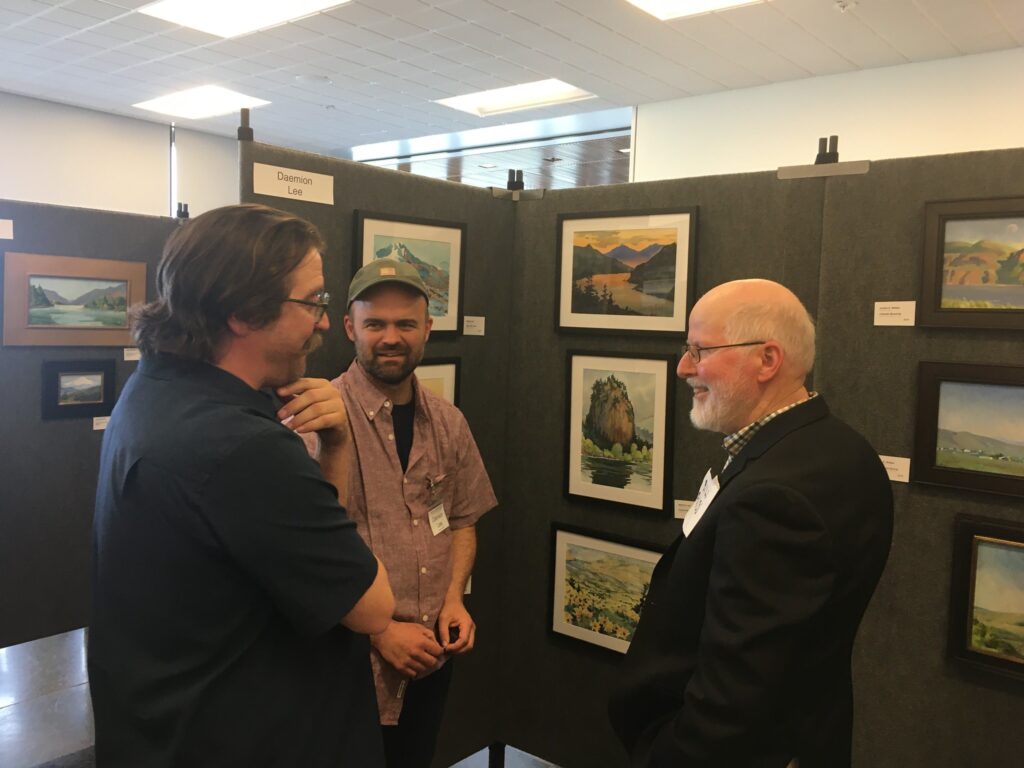
After that, I painted the rest of the painting with the brush. I felt pretty good about this painting. Afterward, I joined about twenty other NWWS painters for the “throwdown”. We all prop up our paintings against a wall so that we can see what everyone has painted. Not only is it fun to see what other painters have done, it’s a great way to learn about other styles and perspectives. I enjoy rubbing elbows with the artists and I try to make contact with as many people as I can.
I drove to the ferry and napped in my car while waiting. It was a good day of painting.
A good day of painting in Seattle Read More »