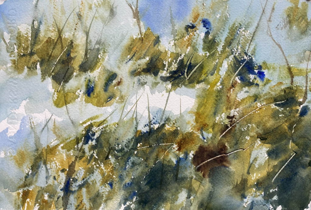
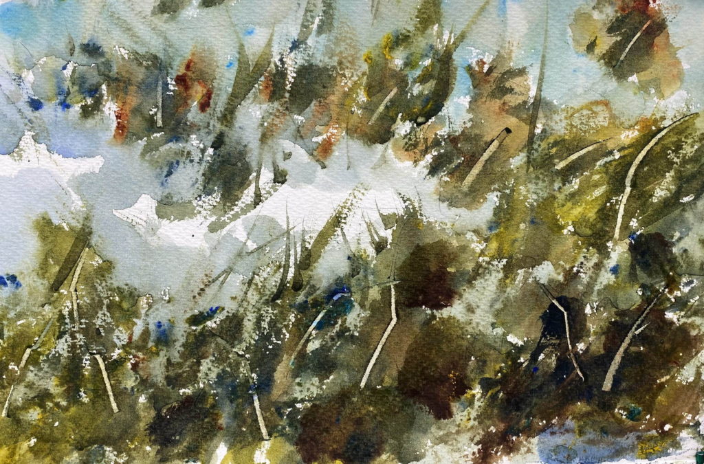
Painting

Looser barns

I liked the barns at Hunter Farms that I painted in my last post, so I decided to paint them again, but more loosely. This time I sprayed the front and the back of the paper with water until it was saturated, then I applied the watercolor washes and let them run. The idea is to get a misty, watery feel to the painting. After letting the initial washes dry, I came back in with a dry brush and painted the darker shapes with harder edges. That way hopefully I would get some soft edges to the shapes and some hard edges.

I painted this scene twice. The first time I let the barns look watery and soft. In the second painting I firmed up the shapes of the barns.

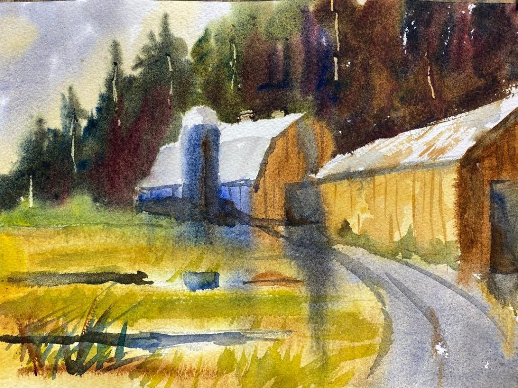
My first painting. This is probably too loose.
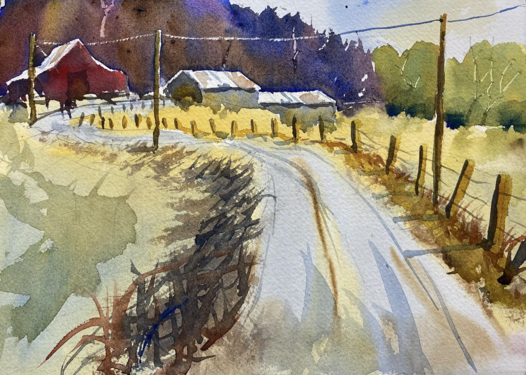
My second painting. Some of the colors from above flow down into the lower area, tying the painting together.

I submitted the second painting to Eric Wiegardt, my watercolor teacher, for our Saturday class critique. He liked the how the blue from the side of the center barn flowed down into the grass. He liked the variation of colors in the trees also. But again he remarked that the shadows in the barn doors and on the silo are”dead.” They need more of the meadow colors brought into them.
Looser barns Read More »

Painting the marsh

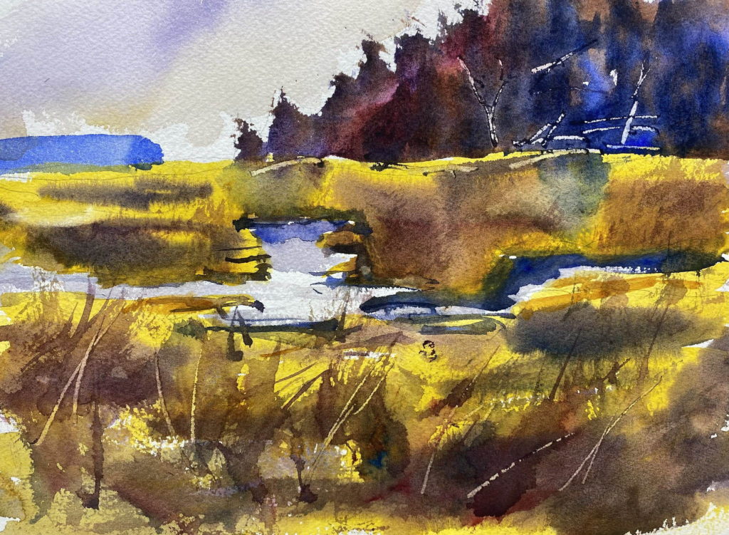
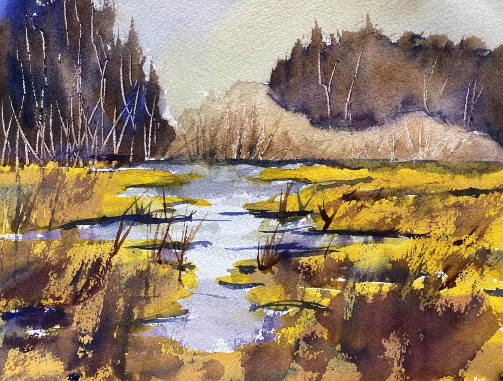
In his demo last week, Eric Wiegardt painted a marsh on Willapa Bay. He emphasized the importance of adding a complementary color to a background wash to make it come alive. The actual color isn’t as importance as the vibration that comes from the two colors together. In his painting, he started with a yellowish wash, then he added strokes of purple, the complement. In this painting, he also showed how to use the mop brush with its bristles splayed out to make the texture for the trees and the grasses.

I made a copy of his painting, then I made another painting from my photo of a marsh on Brownsville Road.

My copy of Eric Wiegardt’s painting
Brownsville Road marsh

Painting the marsh Read More »

Snow Creek farm series

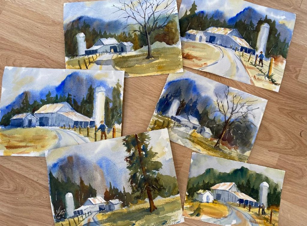
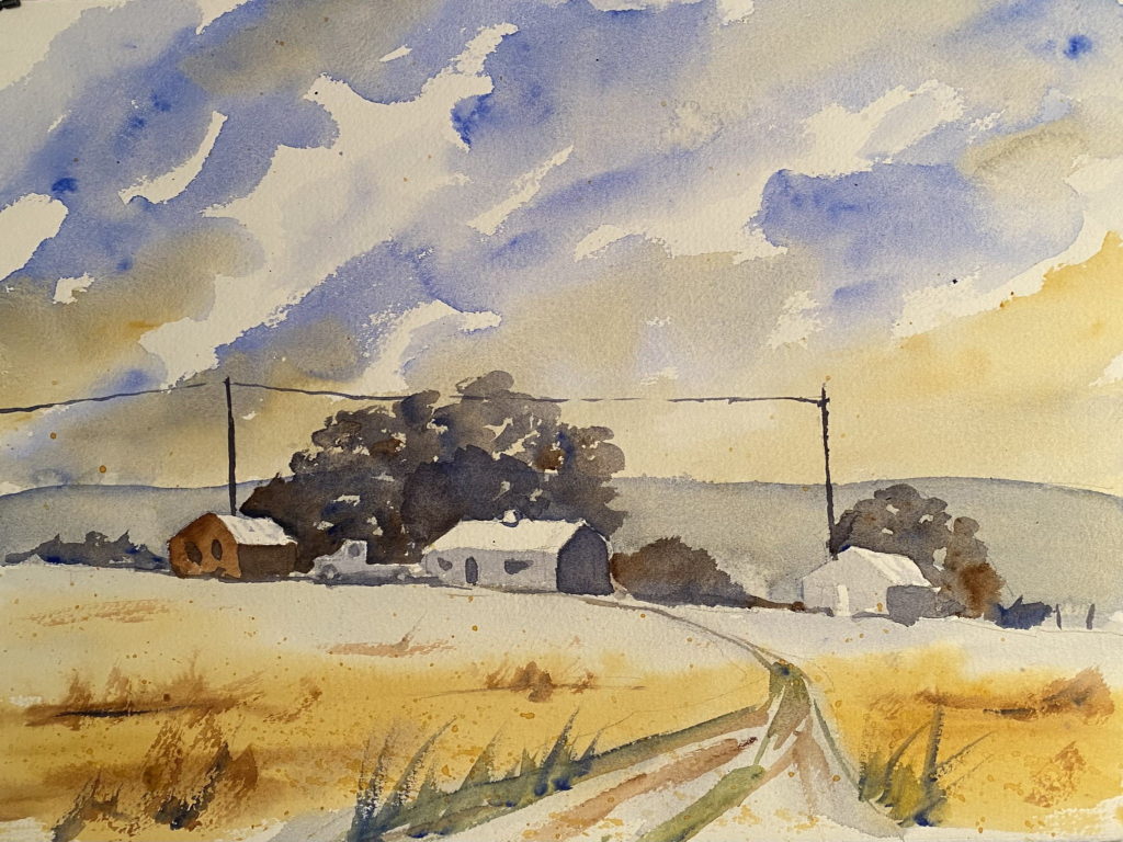
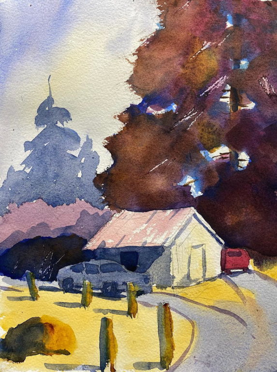
For my homework for last Saturday’s watercolor class with Eric Wiegardt, I painted a farm I visited a couple of summers ago on Snow Creek near Discovery Bay. I wanted to show the hills behind the barn as misty, cloud-draped shapes, and keep the barn and silo as my center of interest. I wasn’t satisfied with my initial attempts, so I kept trying. I did a series of eight paintings all together. Here’s my best attempt and a photo of a bunch of the others.

Eric commented that this watercolor has good separation of values (light grass and dark trees), and he liked the lines showing the curve on the road. He liked the way the green tree color fades into the right side of the shed in the front, and he suggested that I add some color into the shadows of the barn. These gray shadows need to be warmed up with color from the grass.

My best attempt, 9 x 12 inches
Some of my many attempts to paint this scene

Snow Creek farm series Read More »

Winter barn scene

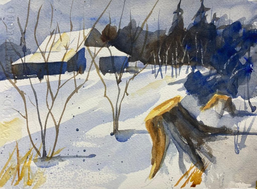
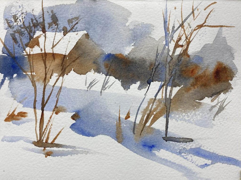
In my last post, I showed three value studies I painted of a winter scene. I took the third one and developed it into a more complete painting. I used only three colors: ultramarine blue, burnt umber, and raw sienna. I think the composition as a whole works well.

Winter barn scene Read More »

Value studies from Claude Croney

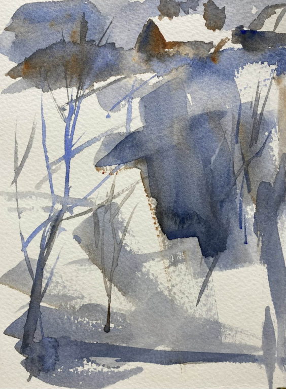
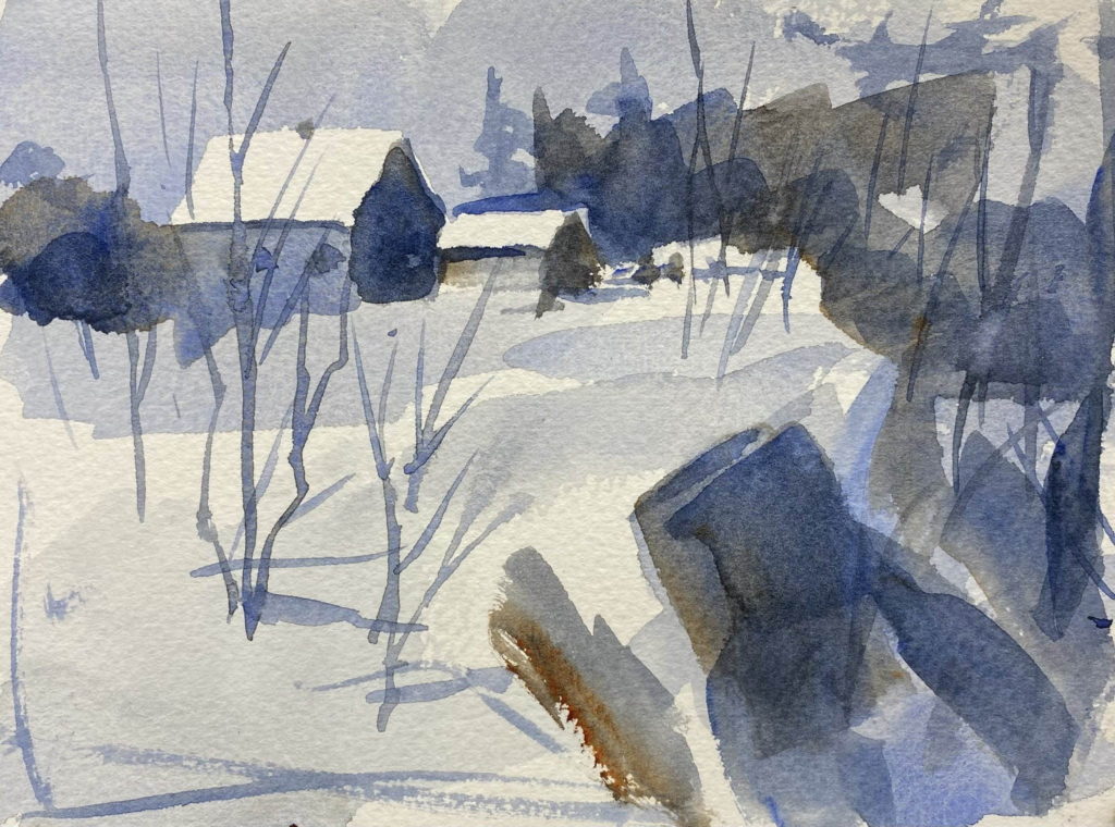
I just bought a used copy of a book published in 1981 by the watercolor artist Claude Croney. In the book, he emphasizes using good abstract composition when creating a painting. In other words, the design should have a good composition regardless of the subject matter. I made three value studies based on his thumbnail sketches. These are small paintings, 5 1/2 x 7 1/2 inches.

In the first one, you can see that the dark line of trees and bushes leads the eye from the right side to the barn, the focal point. The slash of blue beneath it brings the eye back to the right side to start the path again.

First value study

In the second study, the eye is drawn upward to the barn by the strong vertical shape in the lower part of the painting. The dark shape to the left of the barn holds it in place, so that the painting has an inverted ‘L’ shape.

Second value study

In the third painting, The dark shape in the foreground (it might be a stump) starts the eye around a circle shape that leads the eye to the barn.

Third value study

Value studies from Claude Croney Read More »

Colorado ranch scene

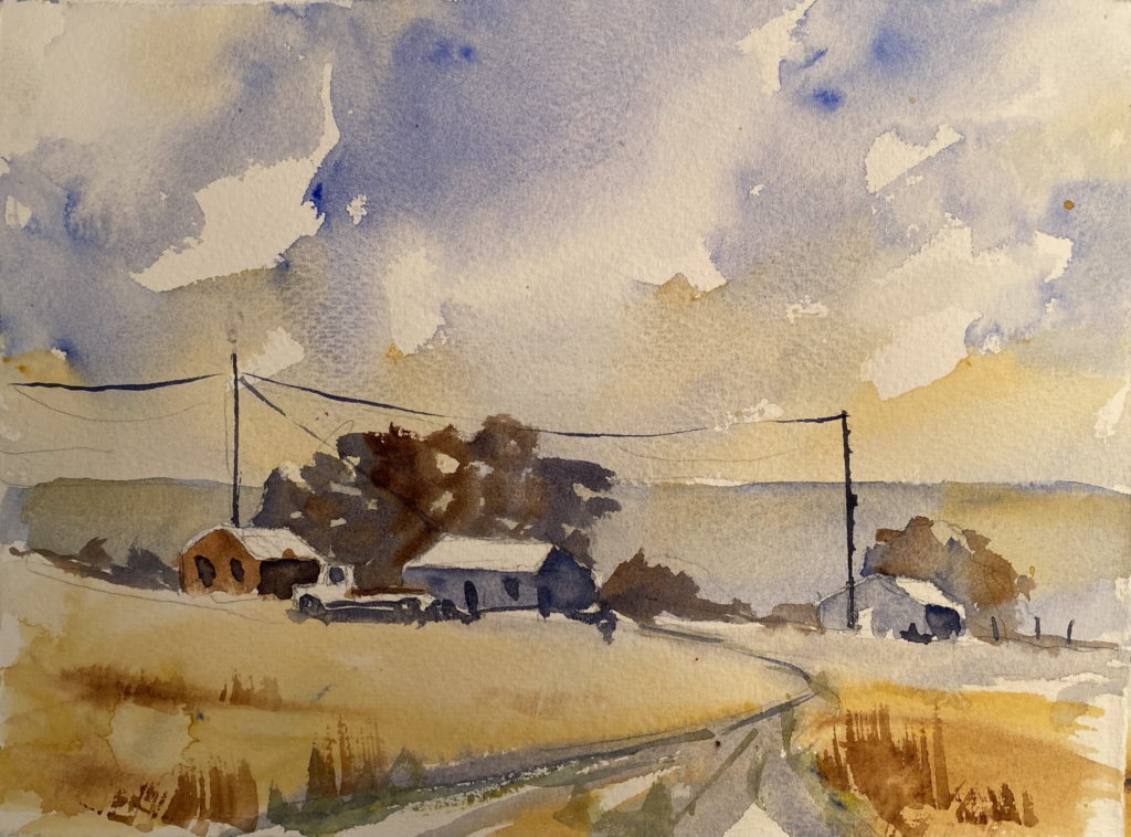
I was in La Junta, Colorado, for my mother’s funeral last week. It was good to be with my whole family and celebrate my mother’s good and long life (she died a few days short of her 103rd birthday).

While I was there, I made a couple of paintings of a scene near La Junta. Last April I painted some ranch buildings located near the highway about five miles south of town. This time I took that plein air painting and tried to improve on it by lowering the horizon and painting a dramatic sky. My first painting is 7 x 11 inches. The second one is 11 x 15 inches. I like these paintings, although it seems like there’s an awful lot of raw sienna (tan) in them.

First attempt – 7 x 11 inches
Second attempt – 11 x 15 inches

Colorado ranch scene Read More »

First Avenue street scene

When we were in Seattle in September for the Van Gogh Experience, I took a photo of First Avenue as we walked to the show. Today I made a painting from that photo. My first attempt was a bit clumsy, so I tried again.

For this painting, I stood at the easel so that I had a free sweep of my arm. I wet the back of the paper which helps keep the surface moist and allows he washes to blend for a longer period of time, and I used a big mop brush. That seemed to help.


First Avenue street scene Read More »

Oyster company dock

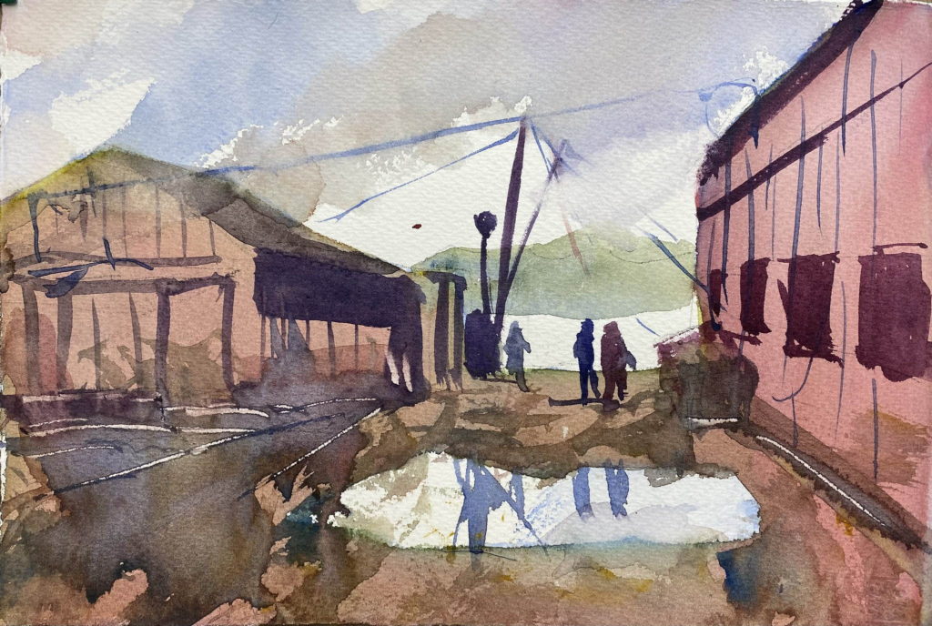
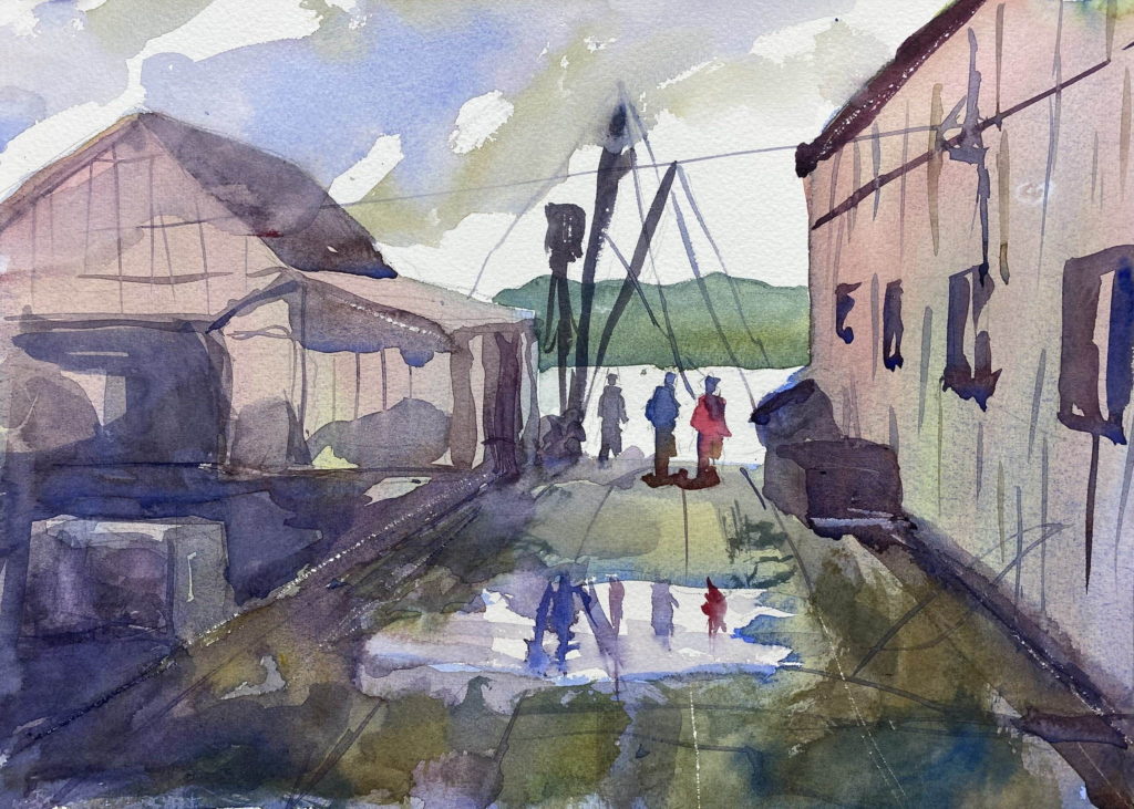
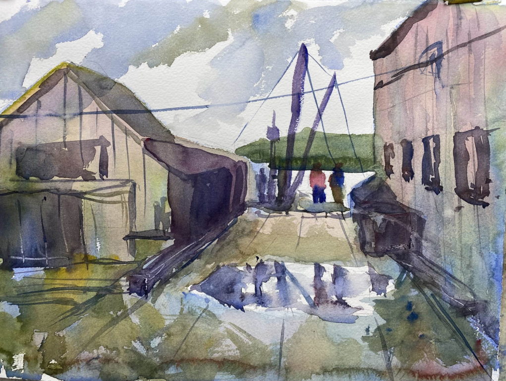
In Eric Weigardt’s watercolor class last Saturday, he painted a demo painting of an oyster company’s dock. I painted a small copy (7 x 10 1/2 inches) yesterday, and painted two larger copies (11 x 15) today. Eric emphasized the single-point perspective that draws the eye to the figures, and the washes on the side of the buildings. These washes are made up of blue, yellow, and red to give a rainbow effect. I think my first, smaller painting was my best. I’m trying to use big washes and stay loose.

7 x 10 1/2 inches
Second attempt 11 x 15 inches
Third attempt 11 x 15 inches

Oyster company dock Read More »

Abstract painting of marsh grass

Our assignment in watercolor class this week is to paint an abstract image of marsh grass. Our instructor, Eric Weigardt, emailed the class a demonstration video, showing how to paint from a photo of marsh grass. He talked as he painted, explaining his thinking and his technique. He used a big mop brush, splaying out the bristles before picking up paint from his palette.

The idea is not to make a literal painting of marsh grass, but to show the pattern of values and colors that give the feel of marsh grass.

I’ve painted this image six times now. It’s a lot harder than it looks. My paintings tend to be muddy and I lose the overall pattern. Below is my best effort so far, with an earlier attempt below that.

My best effort
One of my earlier attempts

Abstract painting of marsh grass Read More »