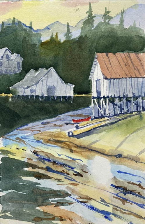
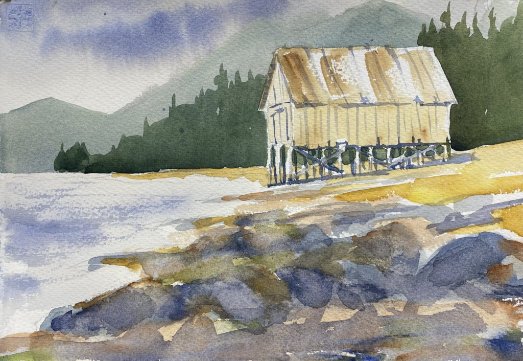
landscapes

Dramatic skies

After watching some videos about painting skies in watercolor, I decided to try to create some sweeping, dramatic skies like those of the English watercolorists. Paintings by Edward Wesson, Trevor Chamberlain, and Edward Seago show moist, colorful English skies, and they’re my models. The sky above us seems blue but it usually has more colors in it, and pale washes of blue, red, and yellow help bring the sky alive.

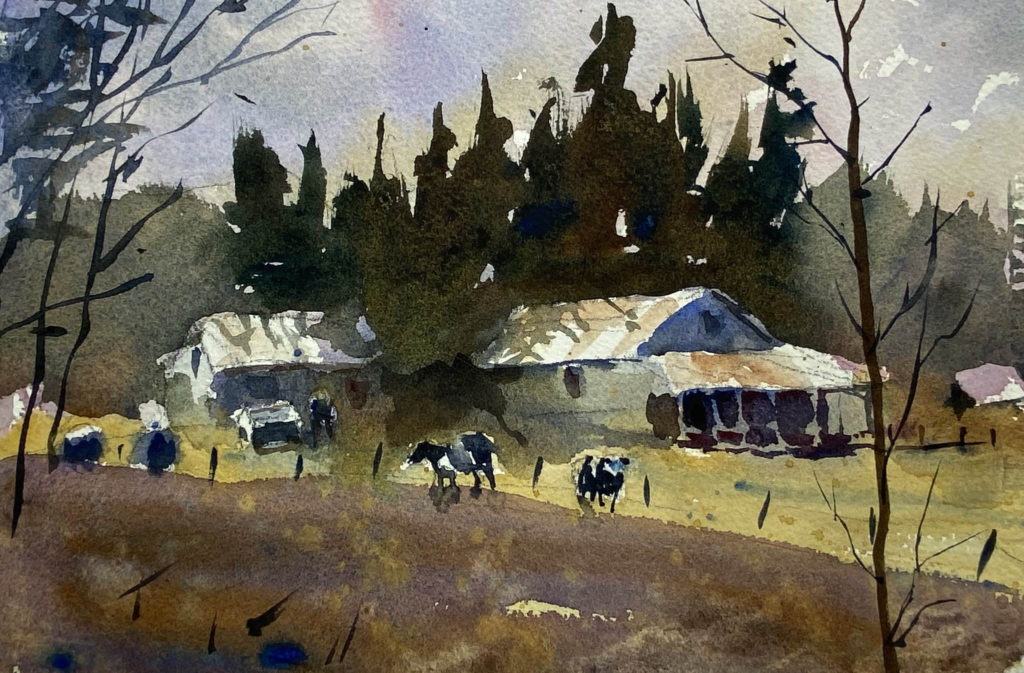
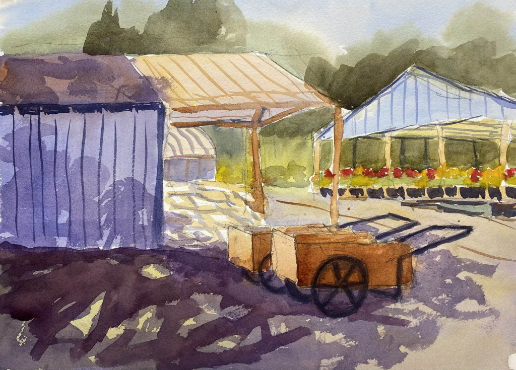
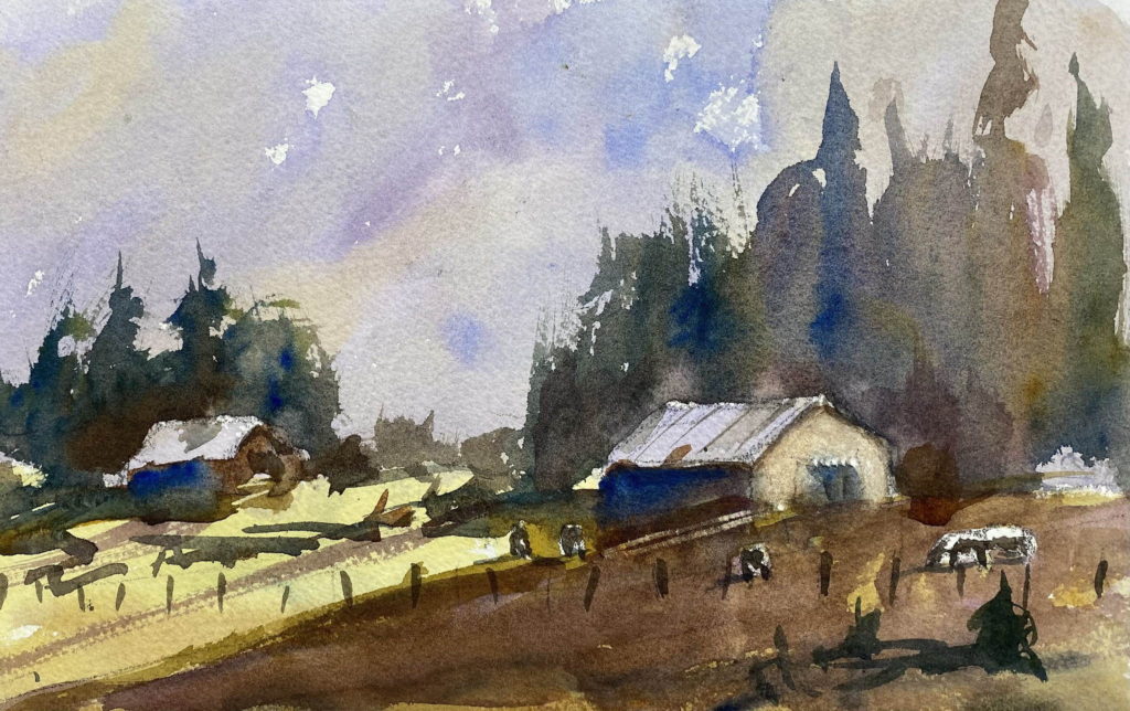
For my first scene, I painted a wet, cloudy sky and let it blend into the field below, painting around the barn. Then I added trees, the barn colors, and the foreground.

First attempt at skies

I liked the way that turned out, so I decided to do it again. This time I added a slash of sunlight coming across the field, which adds a lot of interest to the scene. I also put a few cow-like figures in the field.

Second attempt at skies

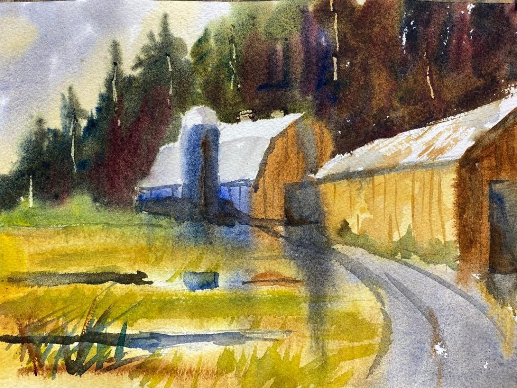
I liked that even better, so I copied a Joseph Zbukvic watercolor for my next attempt. This is an Australian farm, and you can imagine the summer heat. I’m pleased with the way the washes ran together in places, bringing the painting together. This is the way I’d like to paint — loose and suggestive.

Copy of Zbukvic watercolor

Dramatic skies Read More »

Looser barns

I liked the barns at Hunter Farms that I painted in my last post, so I decided to paint them again, but more loosely. This time I sprayed the front and the back of the paper with water until it was saturated, then I applied the watercolor washes and let them run. The idea is to get a misty, watery feel to the painting. After letting the initial washes dry, I came back in with a dry brush and painted the darker shapes with harder edges. That way hopefully I would get some soft edges to the shapes and some hard edges.

I painted this scene twice. The first time I let the barns look watery and soft. In the second painting I firmed up the shapes of the barns.

My first painting. This is probably too loose.
My second painting. Some of the colors from above flow down into the lower area, tying the painting together.

I submitted the second painting to Eric Wiegardt, my watercolor teacher, for our Saturday class critique. He liked the how the blue from the side of the center barn flowed down into the grass. He liked the variation of colors in the trees also. But again he remarked that the shadows in the barn doors and on the silo are”dead.” They need more of the meadow colors brought into them.

Looser barns Read More »

Loosening up

Today I painted two watercolors of subjects I’ve previously painted: the Emmaus Center and the warehouse on Kupreanof Island. It seems that if I paint the same subject over and over, eventually I start to loosen up and the painting looks better. That seems to be the case here.

For my birthday, Katy gave me some handmade watercolor paper that has a lot of character to it. I used it for these paintings and it seems to help me loosen up.

Warehouse on Kupreanof Island
The Emmaus Center on Kupreanof Island

Loosening up Read More »

An exercise in futility

This week I tried to paint a watercolor of Hammer Slough in Petersburg, AK. It’s a picturesque scene, with rustic warehouses on pilings built over the tidewater slough, with a background of dark spruce trees. I made a value study in grays, then I made four attempts in color. I’m afraid none of them are satisfactory. Lesson learned? I really don’t have the skills to paint reflections on a tide flat yet. I’ll keep trying because this is such a classic scene to paint. But right now I think I’ll give it a rest. Watercolor painting is hard!

I’ve shown the value study first, then the four attempts with the earliest attempt first.

Value study
First attempt
Second attempt
Third attempt
Fourth attempt

An exercise in futility Read More »

Net shed on Kupreanof Island

When I was in Alaska last month, I made a pencil drawing of a net shed on Kupreanof Island. These net sheds are used by fishermen to store their nets when not in use. At high tide a boat can pull up to the shed and unload or load the nets.

I made a value study in black and white that I like a lot. Then I made a color version that I didn’t like as much. I put too much color in the foreground rocks, then I had to wipe it out with a wet tissue. I think the foreground needs to be muted in order to draw attention to the shed.

Value study

Net shed on Kupreanof Island Read More »

Roadhouse Nursery

I’ve been busy finishing the inside of Katy’s writing shed, but today I joined four other painters from Poulsbo Artist League for plein air painting at Roadhouse Nursery near Silverdale.

Roadhouse Nursery

The nursery is beautifully landscaped with two or three acres of lawn, tall trees, ponds, raised gardens, and sheds. I focused on these carts that are waiting for a customer to haul off potted plants or potting soil. I found a patch of shade to paint in, but it was a warm, dry day. So I wet the back of my paper to slow down the drying time of my washes. It seemed to help.

Roadhouse Nursery Read More »