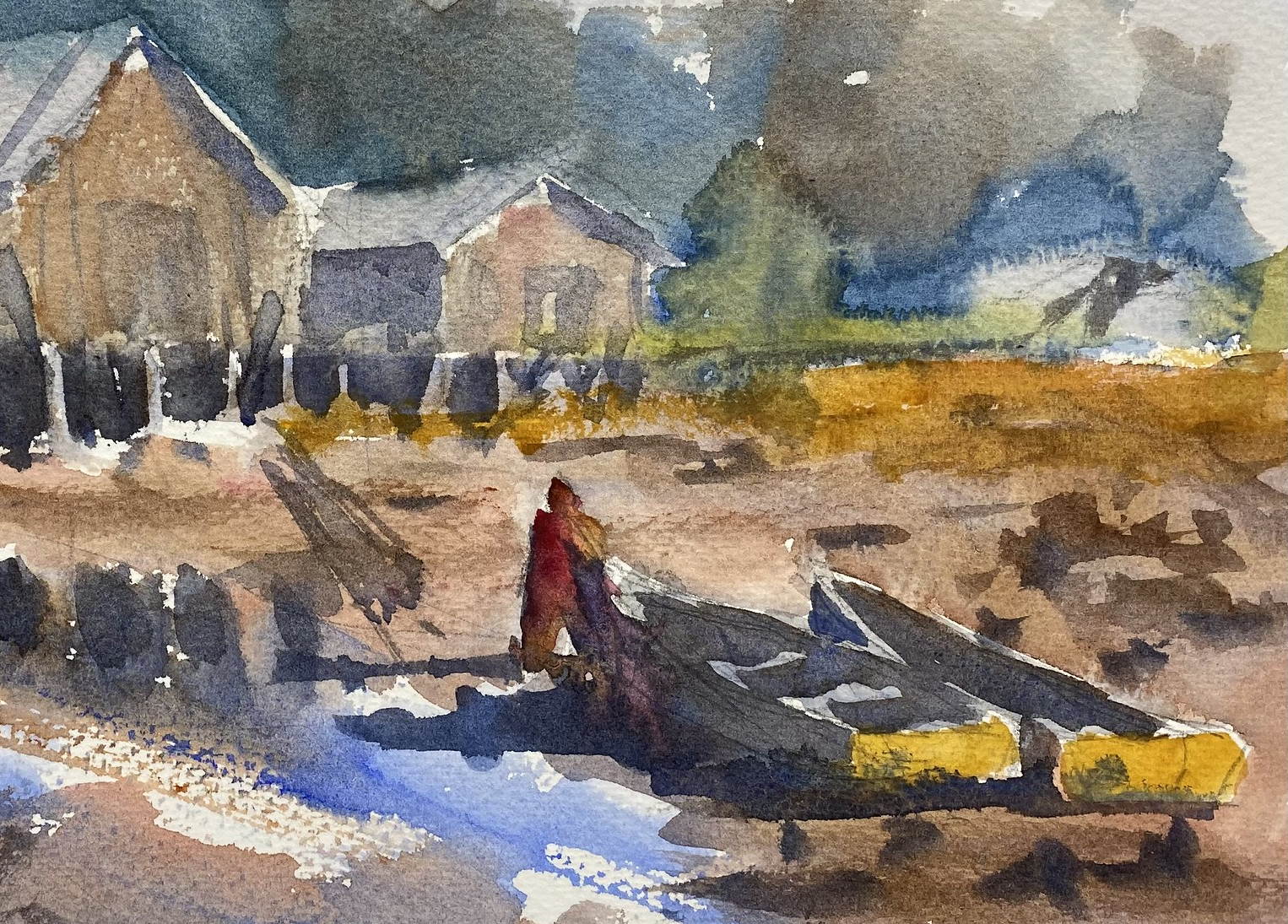
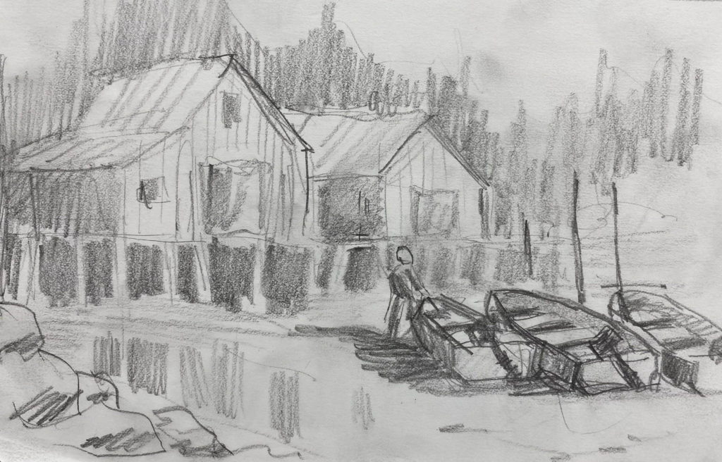
In preparation for my watercolor class with Eric Weigardt last Saturday, I painted a scene from a photo I took at the Petersburg, AK, harbor. The photo shows a fisherman’s warehouse on pilings, with the tide flats in front. In designing the painting, I thought it needed something of interest in the foreground, so I added a figure and a couple of boats. I painted the first version on Monday:

What I like about this painting is the freshness of the brush strokes. The whole piece is painted loosely, which is a goal of mine. It tells a story with the figure and the boats, and it has interesting features to draw the eye, such as the partly obscured warehouse roof on the left and the vague forms on the upper right. But it’s muddy and the shadows seem too dark and prominent.
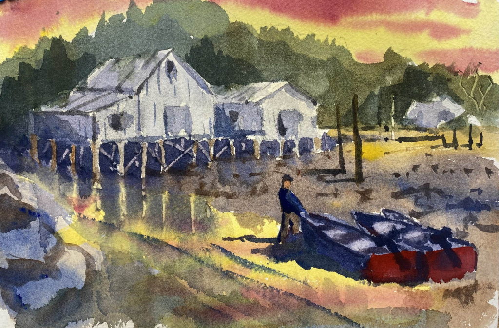
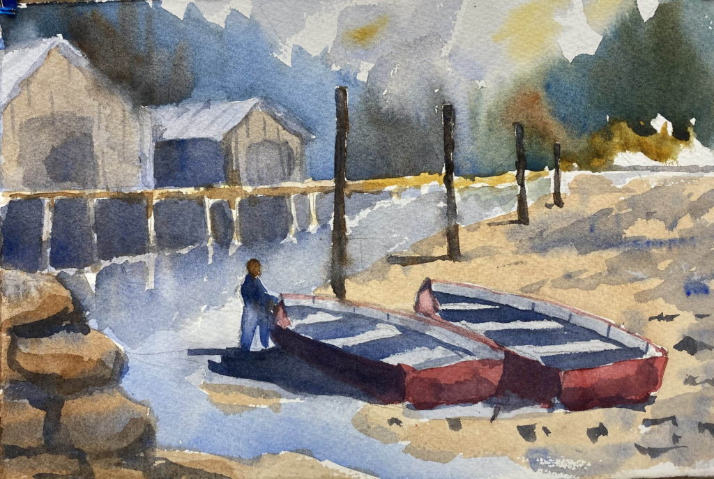
So I tried again. In fact, I tried again six more times. But none of my repeated attempts were better than the first one. In fact, they were worse. Poorer composition, less connectedness, awkward color choices. So for class, I just submitted the first one I painted. Eric’s suggestion was to bring more color into the shadows in the boats and under the warehouses. That’s a good suggestion. I think my shadows are “dead,” and they need more liveliness, more colors.
I think I tried to put to much into the painting. I could have left the boats out and focused on the warehouses. Or I could have painted the boats and left out the warehouses. Or maybe I should have just started a completely different painting rather than spending so much time on this scene. Here are some of my attempts:


