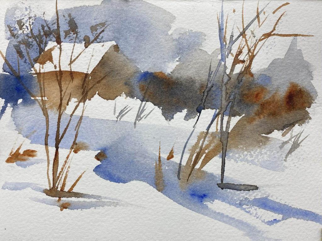
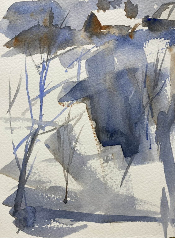
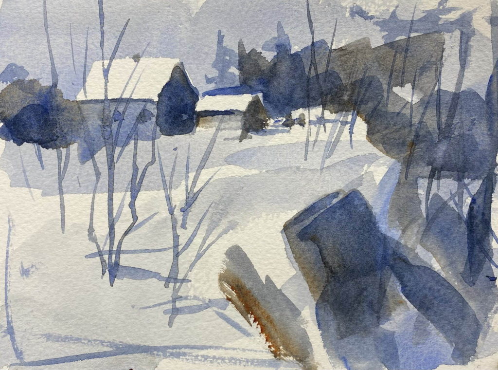
I just bought a used copy of a book published in 1981 by the watercolor artist Claude Croney. In the book, he emphasizes using good abstract composition when creating a painting. In other words, the design should have a good composition regardless of the subject matter. I made three value studies based on his thumbnail sketches. These are small paintings, 5 1/2 x 7 1/2 inches.
In the first one, you can see that the dark line of trees and bushes leads the eye from the right side to the barn, the focal point. The slash of blue beneath it brings the eye back to the right side to start the path again.

In the second study, the eye is drawn upward to the barn by the strong vertical shape in the lower part of the painting. The dark shape to the left of the barn holds it in place, so that the painting has an inverted ‘L’ shape.

In the third painting, The dark shape in the foreground (it might be a stump) starts the eye around a circle shape that leads the eye to the barn.

I can’t help but wonder if the eye is drawn to the familiar (like the barn) as opposed to an unknown object. Just my initial thought.
Yes, I think so, Warren. That’s why I like to have a barn or a shed in my paintings. The eye likes them.
Your values studies always look like finished works of art!
Thanks, Guy. A good value study should grab the eye, just like the finished painting.