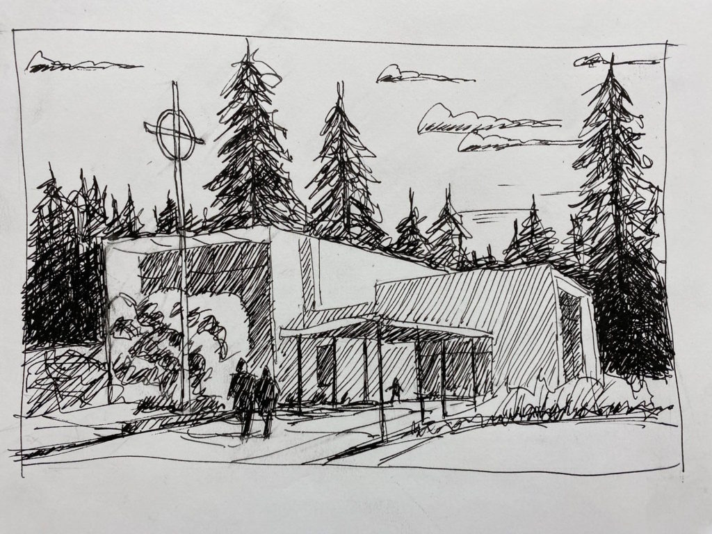
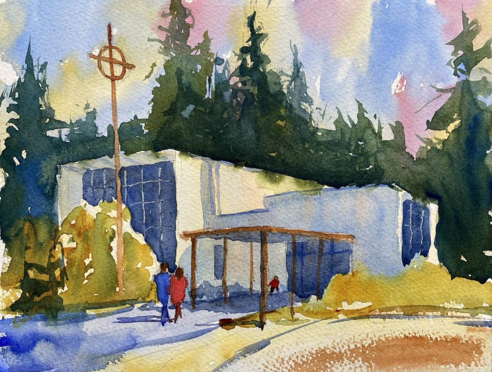
Recently I was asked by my friend, the Rev. Eric Stelle, to paint a watercolor of his church to be used as an item in their silent auction fundraiser. Of course I was eager to please my friend, so I said yes and drove to St. John’s Episcopal Church in Gig Harbor to make a pencil sketch and a plein air painting.
The painting wasn’t good enough to be used for the auction, so I came back to my studio and made another. Again, it wasn’t quite right, so I made another. And another. And another. I made a total of 18 small watercolors, trying to improve each one. Finally I came up against the deadline and sent him three watercolors and an ink sketch.
As I painted the same subject over and over I became very familiar with the scene and I began to vary my interpretation. I think I learned a lot about composition and color choices. But I’m not sure if I want to paint every subject 18 times! I told Eric that he can use the images for their publications (newsletter, letterheads, etc) and for their website. I hope the silent auction will be successful.
Ink sketch of St. John’s, for use in publications and website.Watercolor of St. John’s Episcopal Church, Gig Harbor, WAWatercolor with ink lines.A simplified, more abstract version.
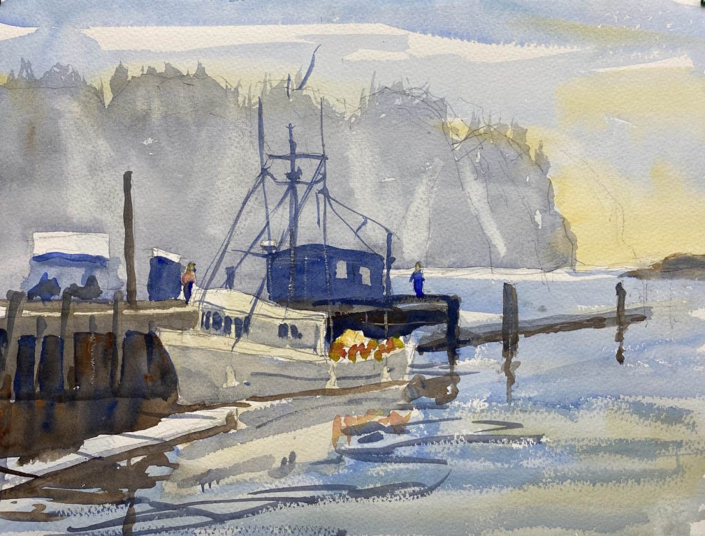
Last week I spent three days painting watercolors at La Push, a small Indian reservation town on the west coast of Washington. The scenery at La Push is awesome: big sea stacks rising out of the ocean, huge waves rolling in to the beach, a working harbor and a picturesque fishing village. I camped at nearby Mora Campground.
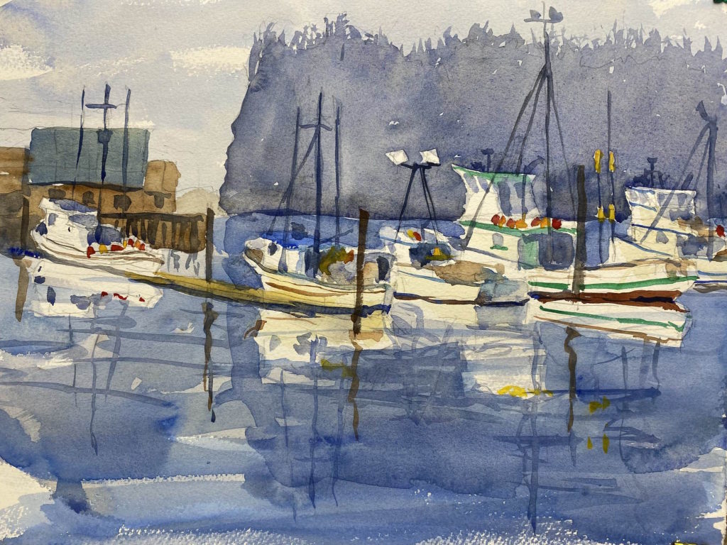
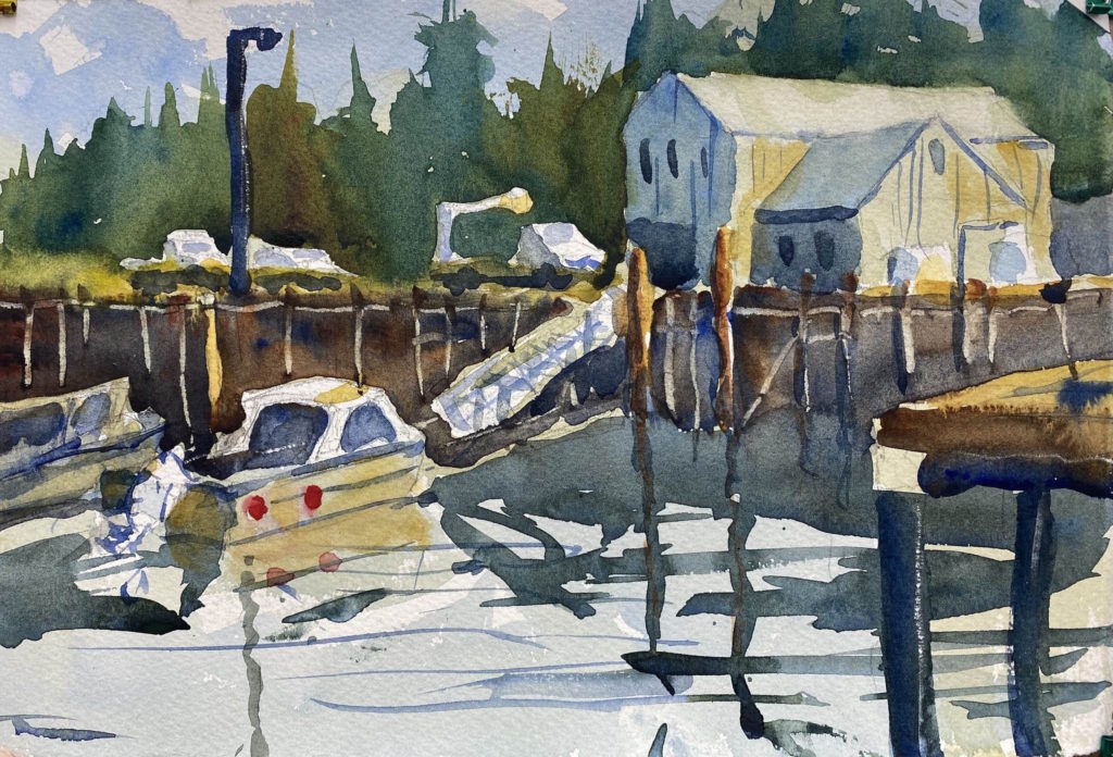
The first afternoon I arrived in La Push and saw a fishing boat unloading tubs of fish at the fish dock, so I set up my easel right away. James Island looms over the entrance to the harbor and makes a great backdrop for paintings. Like many of my plein air paintings, the values were off. Some parts are too light (the island); some parts are too dark (the dock). I plan to paint this again in the studio where I have more control over the values.
La Push harbor
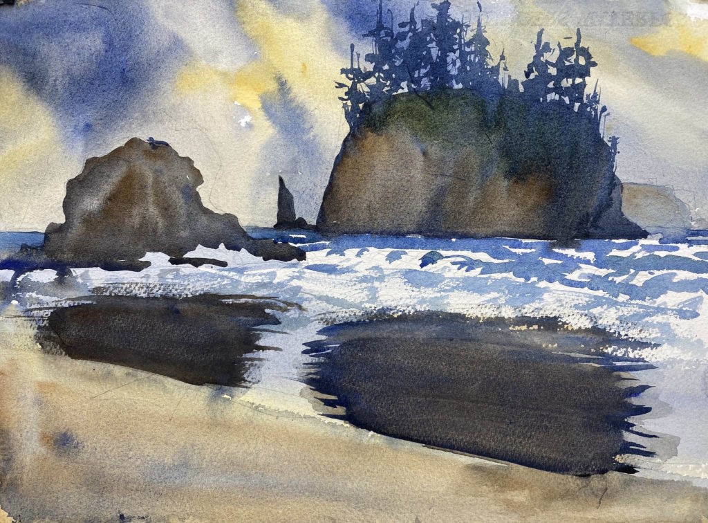
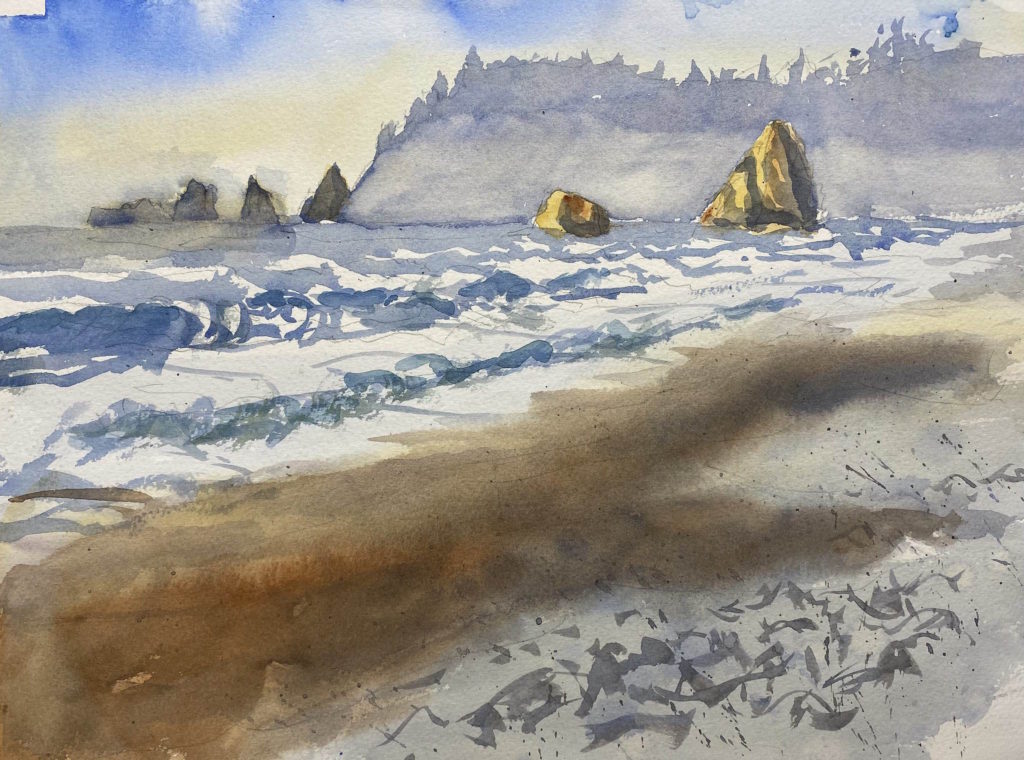
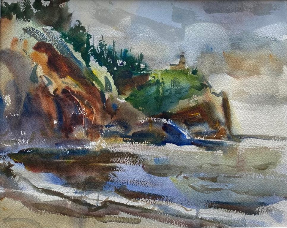
The next morning was cloudy and blustery with a little drizzle. I packed up my gear and hiked the trail to Second Beach. It’s about .7 miles and a stiff climb with all my gear, but the vista was well worth it. A pristine secluded beach with huge rocks jutting out of the ocean and waves rolling in from the Pacific Ocean. I was pretty happy with the top part of the painting, but the bottom is pretty clumsy. I decided to practice painting waves and beach sand when I got home.
Second Beach
In the afternoon I drove to Mora Campground and set up my tent. Rialto Beach is nearby, so I made a painting as the sun was going down. There were crowds of people walking the beach and enjoying the crashing waves and evening sun.
Rialto Beach
On the third day I painted the La Push harbor again, this time with several of the boats at their moorings. It’s a great scene but a real challenge to capture with watercolors. All in all, I was pretty happy with my paintings this trip, considering they were painted outdoors in an unfamiliar environment. Plein air painting is hard! I hope to re-paint these scenes in the studio and produce a more finished product.
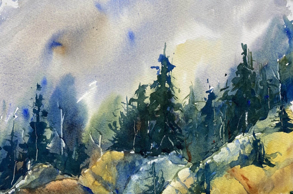
Sometimes it’s good to just play with watercolors. I started this painting by saturating the paper with water, then adding grays, blues, and raw sienna, to get the feeling of a wet day in the Olympic Mountains. Along the lower portion I added greens and blues to simulate trees in the fog. At the very bottom I painted more raw sienna.
As it dried, I envisioned rocks near the bottom so I scraped out some lighter areas with the edge of a credit card. I let this dry thoroughly, which took a long time, then I added some definition to the rocks and some trees above the rocks. Even later I decided I needed taller trees, so I added two more trees. Although I had no source photo, I think it captures the feeling of a foggy day high in the Olympic Mountains.
On my way through Whidbey Island after picking up my paintings from Scott Milo Gallery in Anacortes, I had to wait an hour for my ferry at Coupeville. So I drove up to Fort Casey, right next to the ferry terminal, and set up my easel on a point looking out over the shallow waters of Crockett Lake. My fellow painter Lorraine Goddard showed me this location during the Paint Out. I made a background wash of the clouds, the distant hills and the lake, but I couldn’t finish because the paint was drying so slowly. I packed up and got on the ferry, and when I got home I finished the foreground trees. Pretty happy with this one.
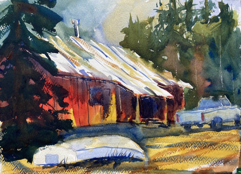
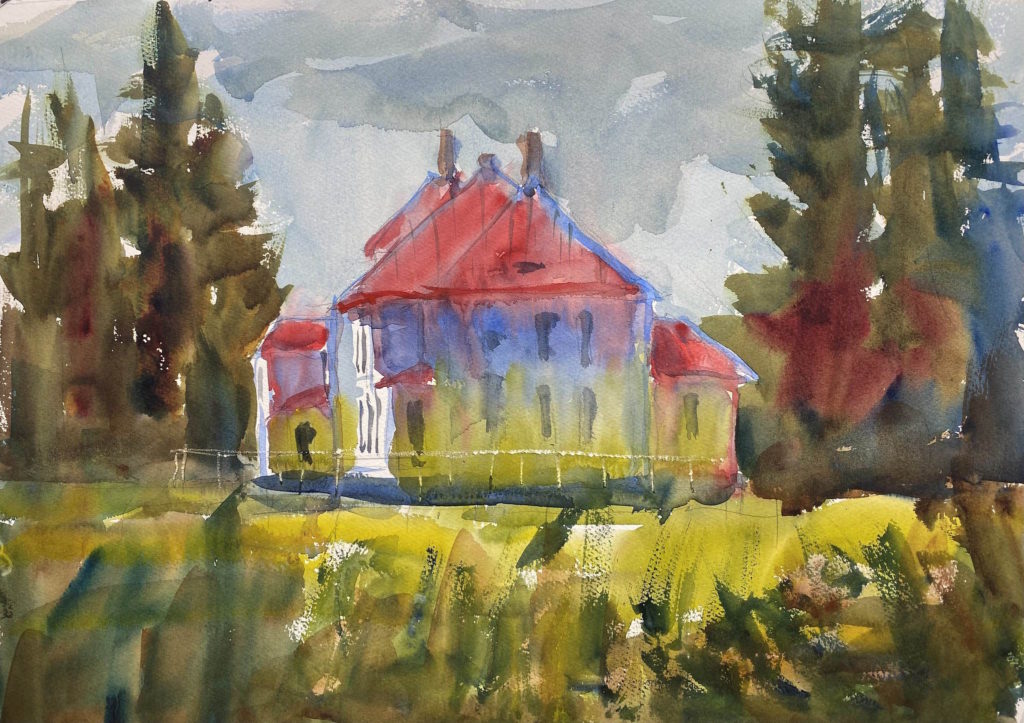
When we drive by the Skokomish Indian Reservation on the way to Hoodsport every Sunday, I keep my eye out for interesting scenes. This house caught my eye because of its gritty, down-home charm. I painted three versions, of which this is the third. I took considerable artistic liberty with this scene (it doesn’t really look like this).
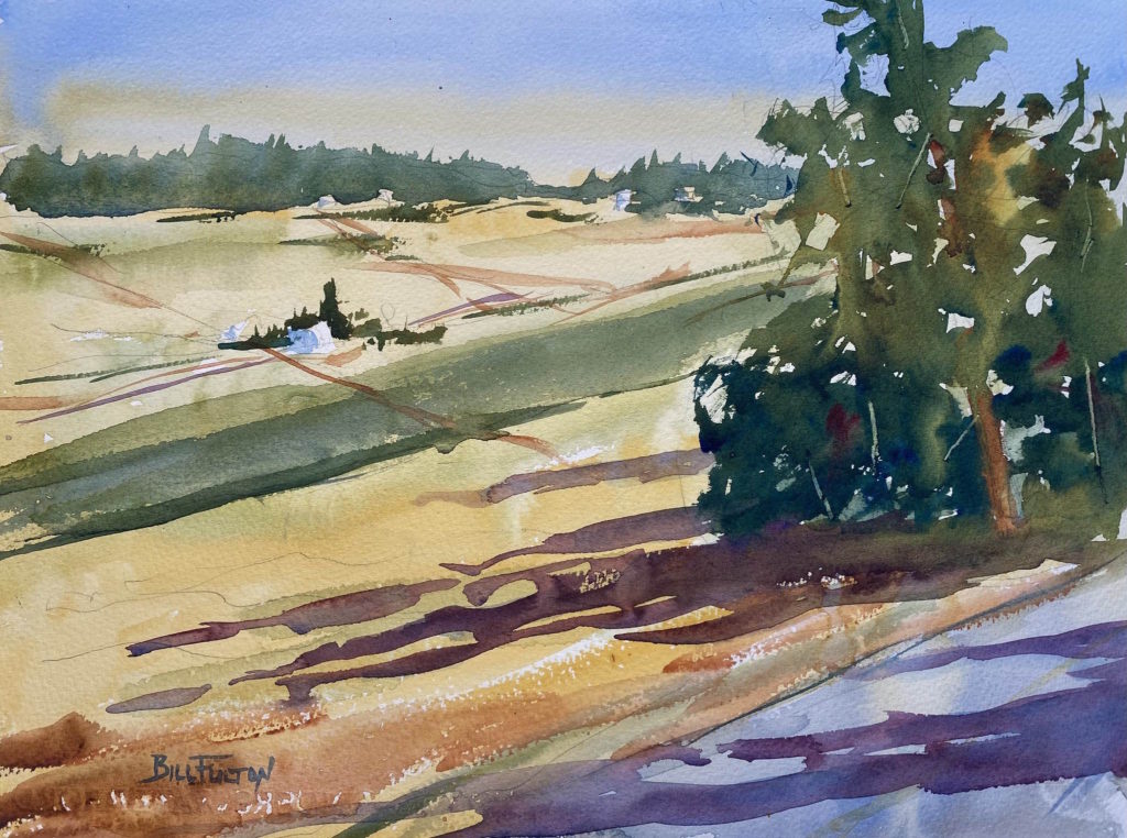
I was flabbergasted and delighted to be awarded an Honorable Mention for one of my paintings at the Whidbey Plein Air Paint Out on August 18. More than 50 painters gathered on Whidbey Island for a four-day festival of outdoor paintings. I camped at Fort Ebey State Park and painted as much as I could for two days. It was wonderful painting alongside other artists and sharing our work. On Friday we hung our paintings in a show which was juried by Kyle Ma. I entered three paintings. Out of 145 paintings in the show, only a handful were watercolors (most people paint in oil). Mine were definitely the loosest of the watercolors, which probably made them stand out. Anyway, I was thrilled to get the award. It’s the first time I’ve been in a juried show, and my first award.
The painting awarded Honorable Mention. Looking out across Ebey’s Prairie near Coupeville, WAAdmiralty Head Lighthouse on Whidbey Island.Stores in downtown Coupeville, WA.
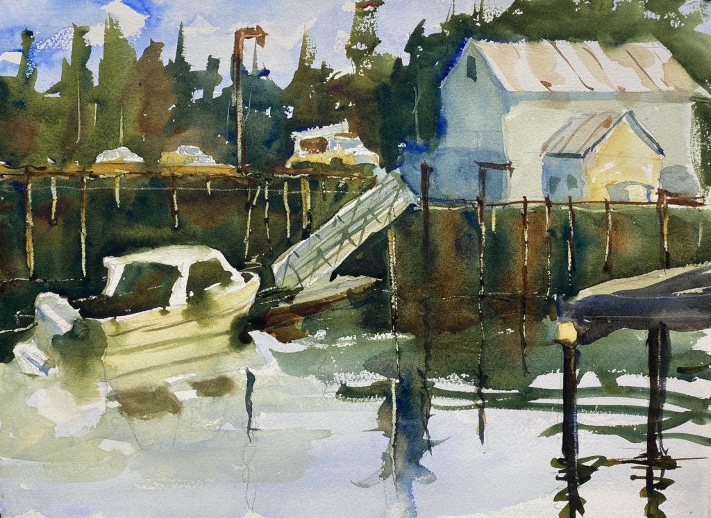
At Eric Wiegardt’s watercolor workshop in Ocean Park, we painted the docks at the Port of Nahcotta. I liked them so much I painted them again when I got home from a photo. Here are two versions.
My second version. This is 11 x 15 inches.My first attempt. This is 7 1/2 x 11 inches.
On the second day of the workshop we drove to the parking lot for the North Point Lighthouse. We didn’t paint the lighthouse itself, but we used the edge of the parking lot as a place to paint.
My copy of Eric’s demo painting.
For his first demo, Eric chose a view looking out through a line of trees to the ocean below. I would never have thought of using this as a subject, so that was a good learning in itself.
He began by making several strong dark vertical marks for the tree trunks. Because his brush was at right angles to the paper, the marks weren’t solid, but they showed flecks of light on either side. Eric explained that this portrays how light wraps around a tree trunk. Don’t just make a solid line.
He went on to brush in the other trees and the foliage, using lots of paint and pushing the brush up into the foliage. He created lots of variety in spacing, color, and texture to make the trees interesting. A few strokes of the palette knife scratched out some branches.
Then he laid in a yellow foreground and filled it with purple brush strokes (the complementary color) and green for the bushes. He left some yellow near the center so that it would draw the eye to the area of dominance (the opening in the trees). He added some bright red to make this area pop.
He laid in a dark blue for the ocean, leaving some slanted areas of white to depict the waves on the beach below. “You only need a suggestion,” he said. Don’t overdo it. The sky was last, with colors from the foreground mixed in.
I set my easel up right next to his completed painting, and shamelessly copied his painting. I had watched the way he used his brush and his palette, and I made a better painting than yesterday. I was pleased that my tree trunks had flecks of light.
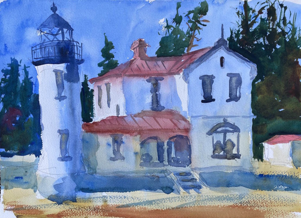
My copy of Eric’s painting of the Lighthouse Keeper’s house.
We ate our sack lunches and then Eric did a second demo. His subject was the lighthouse keeper’s house, a beautifully restored building with a peaked red roof and tall chimneys. The point of the lesson was that although the building was painted white, there are reflected colors on those white surfaces.
He painted the roof with lots of red pigment and water, so that it bled into the upper surfaces of the walls. He introduced a lot of blue in the upper walls to show the reflections from the sky, and he introduced a lot of green in the lower surfaces to show the reflections from the grass. He left a few areas pure white where the sun was shining directly on the walls. The reds, blues, and greens flowed into each other to unify the painting.
I painted the house with gusto, throwing lots of pigment and water on my paper, following Eric’s example. It seemed like too much, but that’s the best way to show off the good qualities of watercolor. I may have gotten a little carried away, but I was pleased that my colors flowed together.
After we’d finished our paintings, we lined them up for Eric to critique. His comments are given kindly, but he gently points out the places for improvement.
We took a break, then we gathered at Eric’s gallery in Ocean Park. I was knocked over when I walked in and saw a large room filled with his large colorful watercolors. They are breathtaking when you’re right in front of them. Eric gave us a tour of the gallery and his studio, where he tapes his Zoom classes, and he regaled us with stories of his family history
Afterward, we gathered across the street at Ann and Eric’s spacious house where we were fed bowls of razor clam chowder from clams that Eric had dug and frozen for this occasion. The chowder was delicious.
After we’d eaten, Ann got us to share one thing about ourselves that no one knew. There were some great stories. It was fun to visualize the other people as their younger selves.
It was a long, action-packed day, and I was tired when I got back to my tent at 9:30. After a call to Katy, I drifted off to sleep right away.
Eric Wiegardt’s demonstration painting at Cape Disappointment
Possibly the best way to increase your watercolor skills quickly is to attend a watercolor workshop with a master painter. Standing just behind them, watching and listening as they explain their choice of subject, the composition, the initial sketch, the use of the brush to apply paint, and the washes as they go on the paper — there’s nothing like being there in person.
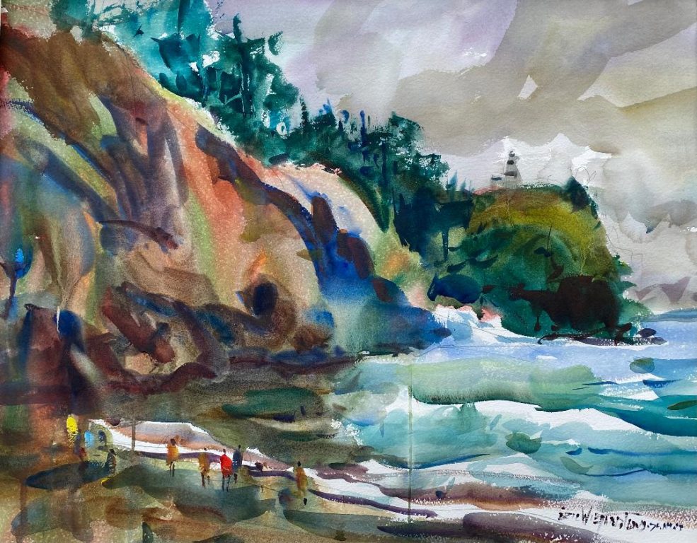
I drove to Long Beach, Washington, last week to attend Eric Wiegardt’s watercolor workshop July 10-13, 2023. I camped at Cape Disappointment State Park, which kept my expenses to a minimum. There were eleven students in the workshop, so everyone got plenty of attention from Eric. He was generous in his time with each of us, giving suggestions and a critique if we wanted it.
The first day we met at the conference room of the Breakers Motel in Long Beach for an introduction to the workshop. I was a little nervous entering a room of strangers, but I quickly felt at home when I met several of the painters I recognized from Eric’s weekly Zoom classes. Eric’s wife, Ann, warmed up the room with her smile and a plate of homemade blueberry muffins. After a short talk by Eric, we piled into our cars and drove to Waikiki Beach at Cape Disappointment State Park. The view encompasses dramatic cliffs looking out to sea, as well as the resolute lighthouse on top of the cliffs.
Eric began with some basics. It’s important to squeeze out fresh watercolor pigment in your palette so you have moist pigment to draw from. He keeps his easel at an angle to let the paint flow down, and he also keeps his palette at an angle so it cleans itself. He wets his brush, then picks up some pigment from the well and lays it on the palette. Then he picks one or two more colors and does the same. The colors are still separate. Then he takes his brush and runs it through the colors in an ‘S’ motion — just once — and applies it to the paper. This results in a juicy wash on the paper with the colors running together, not gray or muddy, but still vibrant.
He emphasized the importance of values. Usually the sky will be the lightest value, the ground or water will be the next lightest, and vertical objects like buildings, trees, and hills will be the darkest values. If you get the values right, the painting will look right. He made a quick value sketch using a thick pencil on white paper. Keep the values to a minimum, no more than five or six. He starts with three values, light, middle, and dark, and then adds a couple more if needed. In this painting with sky and sea, it’s important to make the sea a slightly darker value than the sky.
After quickly sketching the scene on his watercolor paper, he began with a big juicy wash of color in the sky. Using a big brush, he quickly introduced blues and browns. The he moved down to the water and did the same wash, slightly darker. He doesn’t overstroke the washes, but he lays them down and leaves them. This produces a fresh clean look to the painting.
After laying paint on the paper, he rinses the brush off and grabs new fresh color from the palette so that his colors don’t become muddy. Because of this, his paintings are famous for their rich vibrant colors.
Next he modeled the cliffs. He spent some time with his palette, picking up four or five colors with his brush, keeping them separate on the big mop brush. With this loaded brush, he pushed it into the cliff area, producing a variety of colors and shapes. He used plenty of water so that drips ran down the paper. He ignored them, explaining that they’d be picked up later. To finish the cliffs he added dark colors, especially at the bottom, to make them look solidly grounded.
He added some dark colors for the water and the sand below the cliffs so that the shapes weren’t separated. Everything ran together. Using a mop brush with splayed bristles, he dashed in a row of trees along the top of the cliffs. The outside edge of the trees is the important thing to focus on, because that’s what defines them as trees.
He painted the lighthouse, taking care to give it a darker value than the sky. Although the lighthouse is white, it’s still darker than the sky, so it needs to be more of a gray color.
Then he began making adjustments to the values of the painting. He made the water a bit darker, then he added some clouds into the sky to lead the eye downward. The clouds ran right into the trees and merged with the green pigment a little. He added some details, like tree trunks and ripples in the water. Then it was done.
We set up our easels and painted the same scene. I hadn’t listened carefully enough, and my painting was a mess. My cliffs were a big muddy disaster and my water was a gloppy mess.
Eric Wiegardt’s second demonstration painting of Cape Disappointment
After eating lunch, Eric painted the same scene, but this time he emphasized the distant cliffs and added figures on the beach. You can see how lively his painting is.
My painting of Cape Disappointment
My second painting was much more successful. I was careful not to let the cliffs get muddy this time, and I added darks to the bottom of the cliff ,and the far cliff especially, to make them look more solid. The water below the cliffs turned into a mess, but that’s not too distracting. Eric commented that it almost turned into a two-color painting, pink and green, which I hadn’t noticed. He also pointed out that the light portion of the water is confined to a box area and I could have lifted out some light streaks to the left.
But all in all I was pretty happy with my second watercolor. I felt I had learned a tremendous amount and I was eager to try again the next day.
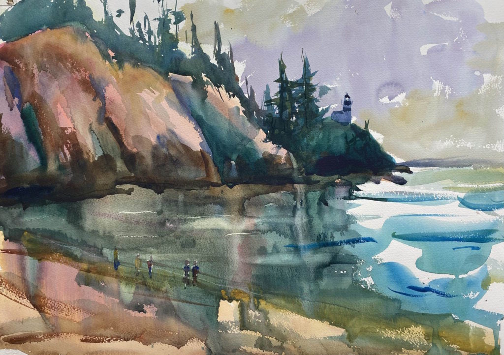
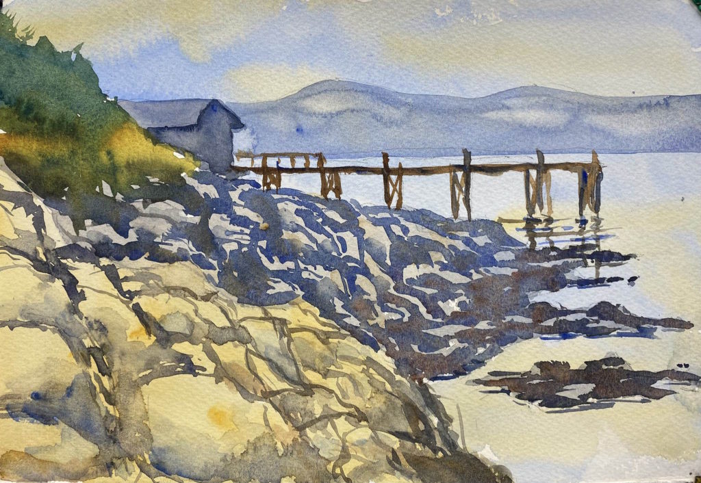
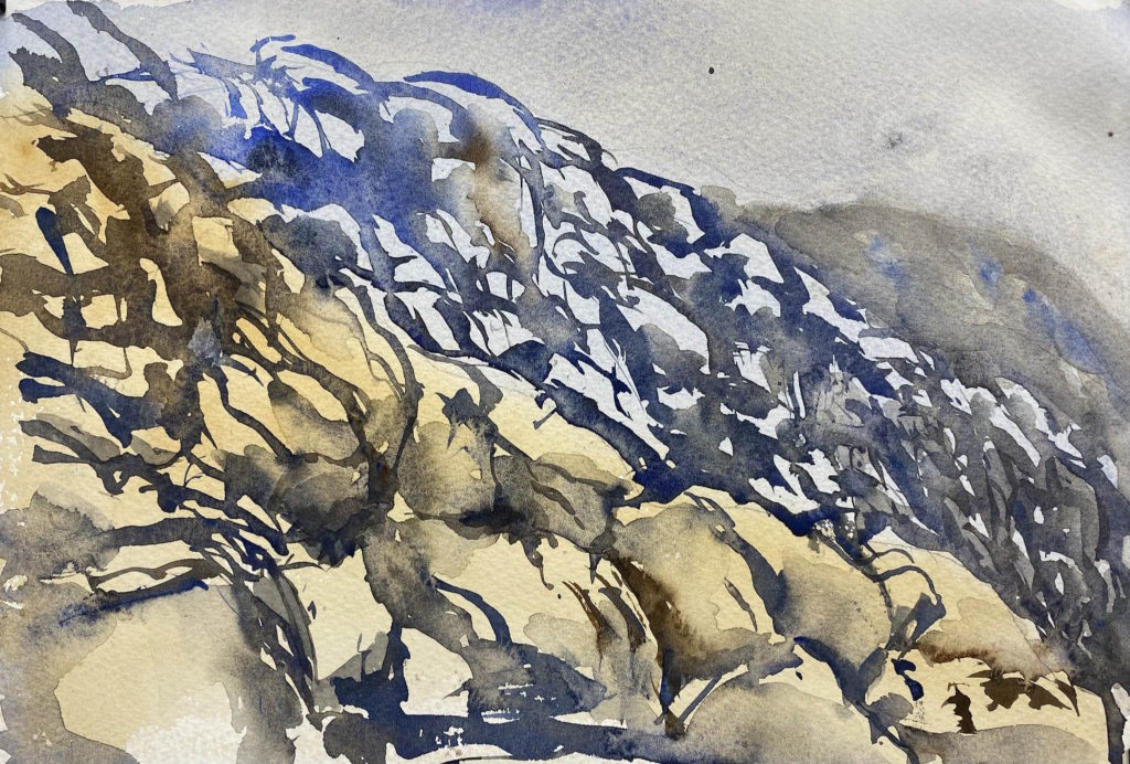
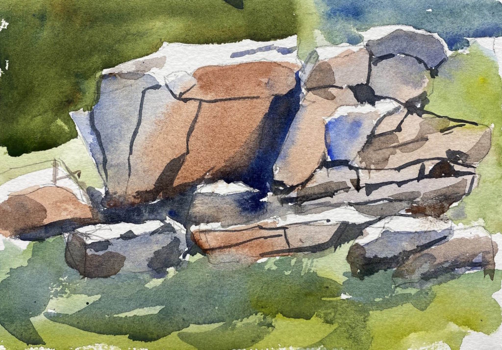
Since my painting trip to Lopez Island, I’ve been learning to paint rocks. I copied a couple of well-known artists, tried my own hand, and then re-painted the scene at the Richardson Road dock. Rocks usually have warm colors on the top and cool colors below. The painting needs to show the contrasting faces of the rock with different tones, and the sizes and lines should be varied.
The dock on RIchardson RoadMy own style of rocksCopy of rocks in a John Singer Sargent paintingCopy of rocks in a Carl Purcell painting