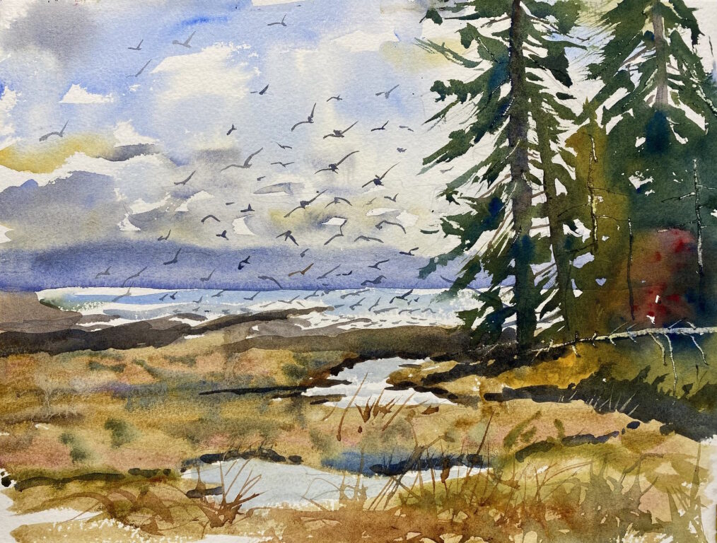
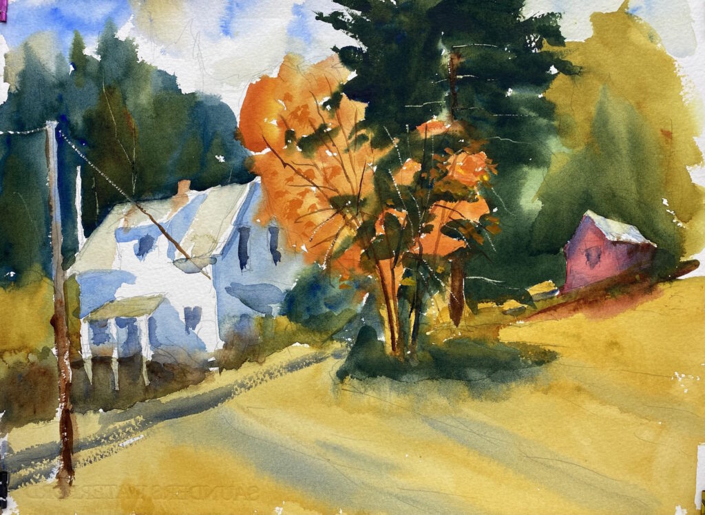
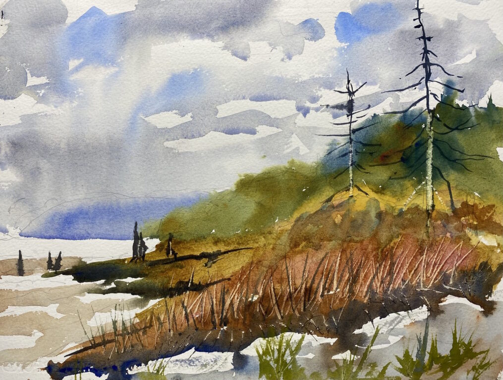
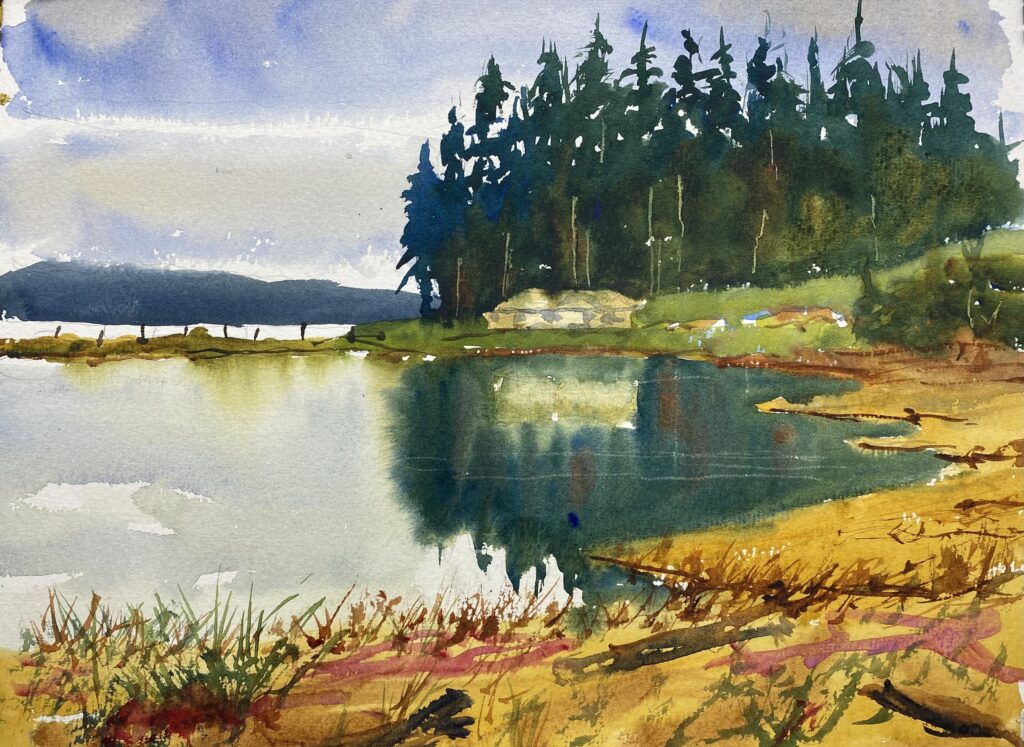
Spring is coming to our area, and it’s time for plein air painting!
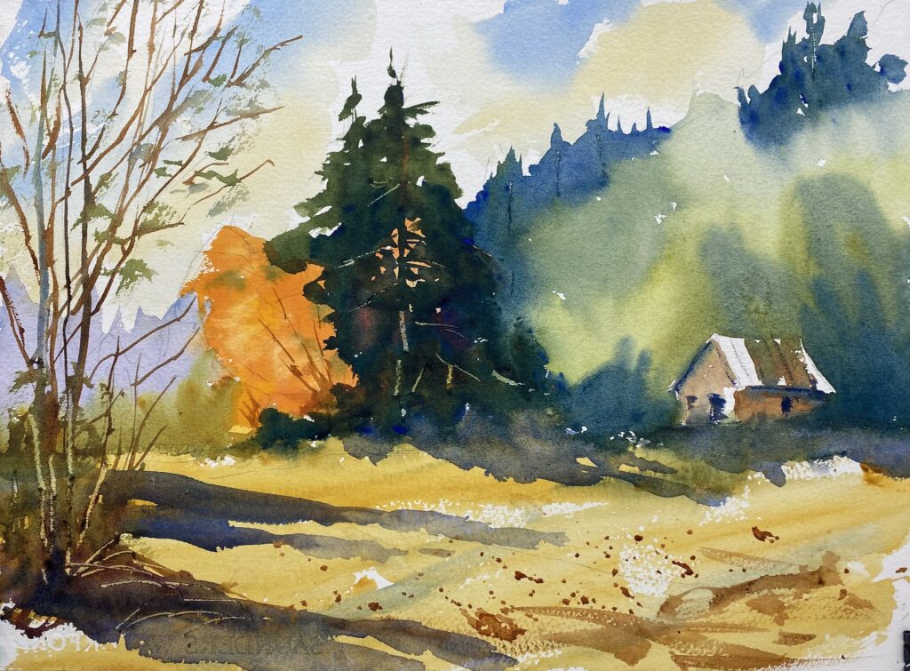
Today I explored the hayfields at Hunter Farms next to the Skokomish River estuary. Walking through the wet grass, I found a wide view of the barns, greenhouses and sheds at Hunter Farms. At first there was a cold breeze, but it eased up as I painted and the sun made a brief appearance.
Lilliwaup Bay
After our church service on Good Friday, I drove about five minutes north of Hoodsport to Lilliwaup Bay. A gravel road winds up the side of the estuary, which is almost untouched by humans. There’s a few old buildings on the far side of the creek that look suitably dIlapidated, so I set my easel on the side of the road to paint them. The sun was warm and the day was cheerful. What better way to spend an hour?
As Katy and I drive to Hoodsport and back every Sunday, I always keep a watch for interesting art subjects. I especially like the odd clutch of shacks and sheds among the trees that you see in rural Washington. One Sunday near Shelton I spotted this cluster of small one-bedroom houses that I just had to paint. In my imagination they were built in the 1940s as housing for Shelton millworkers, or maybe they were tourist cabins that sprang up along Highway 101 in the 1930s.
Last October I agreed to do some art work for the Very Rev. Steve Thomason, Dean of St. Mark’s Episcopal Cathedral in Seattle. He commissioned me to make a few watercolors and ink sketches of the cathedral. He’ll reproduce these and use the prints as thank you gifts for the donors of their fund drive this Spring. Great idea!
I accepted the commission not knowing how burdensome it would be. The cathedral itself is a huge block, a big monolith, with few features to paint. I made a few watercolors that you can see in an earlier post here, but then I got “artist’s block.” How could I make this interesting? I let it rest for a few weeks but when I got back to it, I was still stumped.
Since it was a commission I had agreed to do (and I’d already cashed the check!), I couldn’t give up. In February Steve emailed me and asked how it was coming along. That jolted me into action, so I buckled down and started to work. I searched the cathedral website and Facebook page and found numerous photos that piqued my interest. I especially liked a photo of three acolytes and a robed minister, so I put them in front of the massive cathedral in an ink sketch. I liked that.
Then I made an ink drawing of the front of the cathedral with cross-hatching for the shadows and painted a light wash of ink over the drawing. Because the ink lines were still slightly wet, the ink smeared and created a striking profile of the building.
I like this sketch a lot, but I think it’s too messy for a thank you gift. Plus it’s on flimsy paper. So I decided to do it again on better paper and not quite so messy. It took two attempts, but here’s what I came up with.
Then I made an ink sketch of the interior of the building. It was difficult to get the angles correct and to find the right shading, but I think the result is satisfactory.
Finally, I made one more watercolor of the South side of the cathedral, trying to get a feel for the light on the big mass of the building. I made many other sketches and paintings that didn’t make the grade and I spent a lot of time on this commission, way more than I planned. I’m thankful for the commission (and the income) and I’m grateful that my art work will be seen by the donors recognized by the Dean, but I had no idea this commission would commandeer several weeks of my life. The next time I’m asked to do a commission, I think I’ll politely decline!
Last week I was in Bainbridge Island where I saw a house on Manitou Beach Drive that caught my eye. It was a shabby old-fashioned wood-frame house set among flashier million-dollar homes. All of them have eye-opening views of Puget Sound and the Seattle skyline, and it’s a mystery why this old house remains amid the gentrification. But it satisfies my eye much more than the new sterile structures.
Looking up at the house from the beach, you see an even row of boulders placed by the road crew to protect the shoreline. They look boring to me, so I changed them into a line of uneven rocks coming down to the sand.
I made a black-and-white painting to get my values correct, then over several days I made three watercolor paintings. I’m not sure which one is best. Here they are, from the last to the first.
If watercolor painting is the hardest medium to master, I think painting the human face in watercolor is even harder! Recently I took an online watercolor portrait workshop with Annette Smith from Scottsdale Artist’s School, a highly-regarded art school in Phoenix, AZ. Annette was a student of the late Charles Reid, whom I greatly admire for his loose, colorful portraits. The workshop met on Zoom on three successive Tuesdays, giving us time to paint between classes. For each Zoom session, Annette painted a three-hour portrait, talking us through everything she did.
Annette draws the model very carefully, taking a long time to get all the features accurately. She uses a measuring stick to compare the distances between features. For instance, the width of the face is often the same as the distance from the chin to the eyebrows. She’s very particular about the drawing.
She then paints the face with a light wash, using the three primary colors of yellow, red, and blue. This underpainting will glow through the other layers painted on top of it. She paints the hair with more than one color, allowing the colors to blend, then she creates the eyes and eye sockets and defines the planes of the face, lips, and chin.
She mixes her paints in the palette before she begins a wash, and she carefully places a brush full of paint on the paper. Then she swirls the brush slightly, cleans it in water, and softens the edges of the brushstroke. It makes for beautiful skin tones in the face. There are very few hard edges in her portraits; everything blends together.
It took me four tries to get a satisfactory portrait of our first model, a lovely young lady.
I only needed two attempts for my second portrait of a young Hispanic man dressed as a troubadour.
Our third and final model was a beautiful black woman with high cheekbones.
I learned a lot from this workshop. Just watching Annette choose her colors and apply the paint to the paper was a revelation. I have a long way to go before I can produce good portraits, but I think I made a big leap forward in this workshop.
The harbor at Bay Center, WA, is a jumble of activity with oyster boats, docks, and cranes. My eye was immediately caught by the workers on these two boats and the shadows of the docks when I passed through last summer. I took a photo and made this painting recently in my studio.
Most people don’t think of a clearcut as a subject for a painting, but when I crested the ridge over Port Hadlock recently, I looked back to see a sprawling view of Puget Sound, framed with an island of trees left by the loggers. What could be more Pacific Northwest than a clearcut view? I took some photos and came back to my studio to paint the scene. My first attempt had too many hard edges, so I painted it again with some soft edges. Here’s my second painting, with the first attempt below it. You can see how I let the bottom edge of the clump of trees on the left blend into the yellow below, and I let the edge of the far gray mountains blur into the sky. I also added some purple to complement the field of yellow in the clearcut.
As I look back on my paintings over the course of 2023, I see some progress. Compared to this time last year, I feel my paintings are more confident and more accomplished, and other people have remarked on the progress. The big watershed for me was a four-day workshop I took with my teacher, Eric Wiegardt, near his home in Long Beach, Washington. Eric uses lots of paint and lots of water, and he paints with confidence. When I do that, my paintings are more lively and more powerful.
Here’s a painting I did in January that’s fussy and disconnected. Things just don’t flow.
Here’s a painting I did near the end of the year, where you can see the brush strokes blending together in a harmonious way.
I made a determined effort last year to learn to paint trees, using a splayed out mop brush like Eric taught us. I think my trees are much better now.
I also worked hard to connect my shapes and washes so that the painting doesn’t look like a bunch of disconnected shapes. I think I improved here, too.
I traveled to different areas in Western Washington on six occasions to paint outdoors, often with other painters, and I learned a lot from these trips. Not that the paintings were always successful, but the experience of painting outside helped me when I got back to the studio.
I’ve tried to choose a wide variety of subjects — beaches, tide flats, buildings, boats, farms and forests — although I can see I have a preference for subjects around the water. It just feels more dramatic to me.
Often it feels that I am fighting a painting. My brush strokes are dry and scratchy, my shapes are disconnected and awkward, and the painting just doesn’t come together. Other times the paint flows, the shapes magically seem to blend into each other, and the painting takes on a life of its own. Let’s hope for more of the latter in the coming year!
Every Sunday Katy and I drive over the Skokomish River where it empties into tidewater at Hood Canal. It’s a rich area for wildlife and fish because of the mix of fresh and salt water, and it’s visually interesting because of the variety of waterways: mud flats, old pilings, the winding river, swampy low areas, hay fields and old barns.
A couple of Sundays ago, as we drove past, the tide was high and the water was up into the bushes beside the river. I took some photos of the tide flats out of the window of the car (Katy was driving). Later, I used one of those photos to make this watercolor. I painted wet-into-wet for the background to produce the soft layer of foggy trees, than I added the foreground with dry strokes.