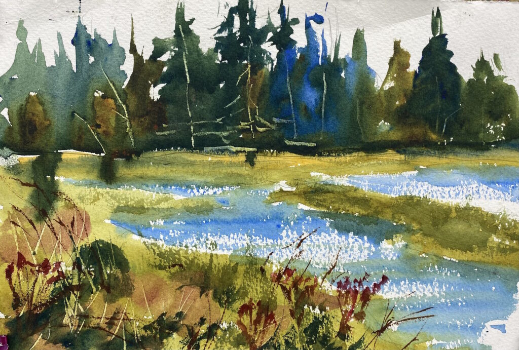
On a blustery day I walked along the beach to the estuary at Shine Tidelands State Park. The wind was blowing and the tide was coming in rapidly. It felt good to be alive! Because of the wind, I couldn’t set up my easel, so I knelt down in the grass and painted while kneeling.
Below the painting is a short video taken on the spot. It’s difficult to hear because of the wind, but it gives you the idea of my experience.
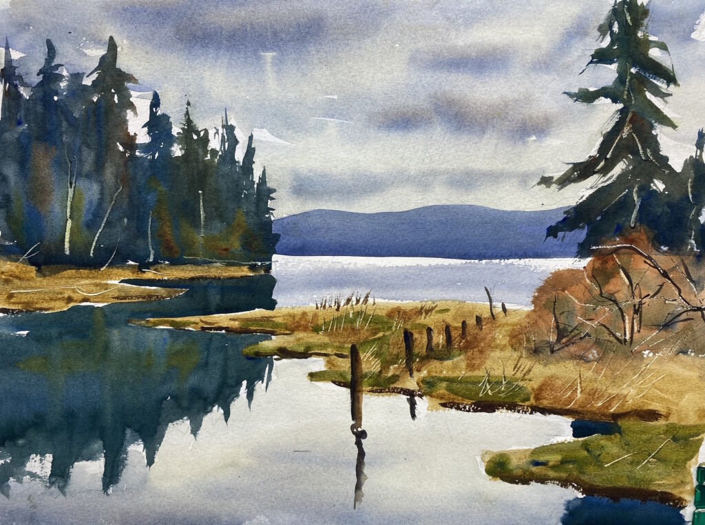
It’s not easy to find a good subject to paint on a cloudy day. There are no shadows or streaks of sunlight to paint, and every surface has the same dull light. The good thing about cloudy days is that you can paint a more moody picture.
On this day, I went to Virginia Point Road where it crosses an inlet of Liberty Bay near Keyport. The tide was high and I found a good place to paint just off the road. I had to paint the clouds in the sky and the reflections twice because they weren’t dark enough the first time, but I think I got it about right. I like the sky and the feeling of depth in the painting.
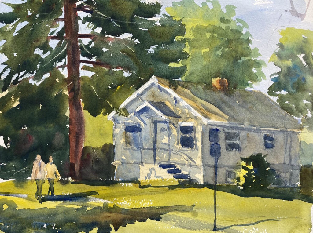
I chose this house as my subject because of the dappled sunlight on the front of the house. When I set up my easel across the street, I noticed a woman in the back yard, so I waved at her. She waved back, and I went across the street to talk to her. She was probably 50 years old with long blonde hair and a weary face. She said she’s lived there for 18 years. She was surprised that anyone would be interested in painting her 100-year-old house, but I reassured her that these classic old houses are my favorites. Besides, the sunlight and shadows made a great subject.
On a sunny autumn afternoon, the warm sunshine and cool shadows on RK Mart in Manette caught my eye. Manette is a lively, funky neighborhood of Bremerton, just across the Manette bridge. As I painted, a number of people with yoga mats passed me on their way to the yoga studio nearby. I enjoyed painting the figures as they were coming out of the store or going in.
This summer I’ve made a concerted effort to get myself out of the studio and paint in the open air. I grab my watercolor bag that has my palette, brushes, water container, and paper, and jump in the car for an adventure. In the car is my collapsible aluminum easel and a homemade shelf that holds my palette, water, and brushes.
I’ve driven all over Kitsap County and the surrounding area looking for good painting locations. I especially like the hidden, forgotten, and out-of-the-way places, like waterways, shorelines, estuaries, and back alleys. Not only do I enjoy painting the scene, but I feel connected to the place I’m painting. I soak in the sights, sounds, and smells. It’s an immersion experience; it’s exhilarating.
Painting “plein air” like this often produces exciting paintings because of the immediacy and freshness that goes into the painting. There’s no time to be fussy; just get the paint on the paper. Some of my best paintings have been painted outside.
On the other hand, the chances of producing a total failure go way up. Sometimes my plein air painting is a disappointing flop. This is especially true if I’m attempting a scene I’m not familiar with. But you can’t grow unless you take risks, so I plunge ahead.
Here are some of my recent plein air paintings, both good and bad. Click on an image to see the slideshow.
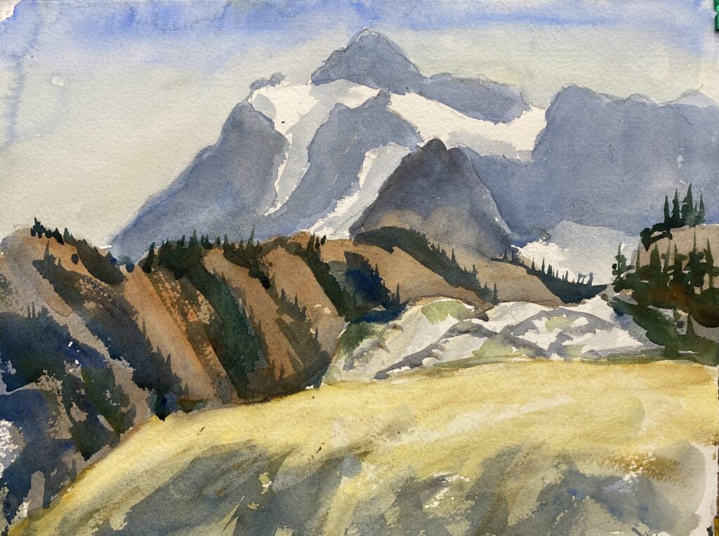
Artist’s Point, as the name implies, is one of the most grand vistas for painters and photographers in all of Washington. From this viewpoint, snowy mountains stretch away in every direction. There’s a painting everywhere you look. The huge parking lot at the end of the road was jammed with vacationers, tourists, hikers, and artists.
I camped along the Nooksack River at a campground about 40 minutes from Artist’s Point, and spent two days painting with my friends from Plein Air Washington Artists. The weather was sunny and hot, even up at such a high elevation. As a result, the washes dried very quickly, making it difficult to make the painting flow together. After several disappointing paintings, I tried soaking the back of the paper with water before I began painting. This helped a lot.
I made three paintings each day, but this was the only one I was remotely satisfied with. Despite my struggles, the experience of being in the high mountains was well worth the trip. I’ll be back another year.
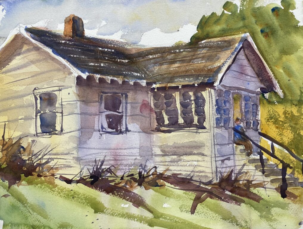
This dilapidated old house is just off the main street in downtown Manette. I love these old houses that have such character; they have a certain charm that comes from old-time craftsmanship. As I was painting, the neighbor drove up, and I asked him about the house. He said it was recently bought by a developer and will likely be torn down soon. Too bad. So long, old friend.
Recently my son, Guy, and I drove up the steep and winding road to Deer Park in Olympic National Park. We camped in the small campground at the end of the road just below the top of Blue Mountain. In the morning I got up early and made a watercolor of the sun streaming across the alpine meadow, hitting the fir trees, with the sun on the mountain peaks in the background.
It’s a glorious place to camp and a wonderful place to paint. Because I’m not used to painting mountain scenes, it took me several tries to understand how to portray the alpine scenery. I plan on going back many more time to try again.
My watercolor teacher, Eric Wiegardt, has encouraged us to “draw with the brush”, that is, to begin the painting boldly with the brush, with no pencil lines to use as a guide.
Normally I begin my painting with a pencil outline so that I know where my shapes are. Without the pencil lines to go by, the huge expanse of white paper seems overwhelming. The problem with beginning with a pencil outline is that you tend to just fill in the outline with watercolor, resulting in a stiff, paint-by-numbers feeling.
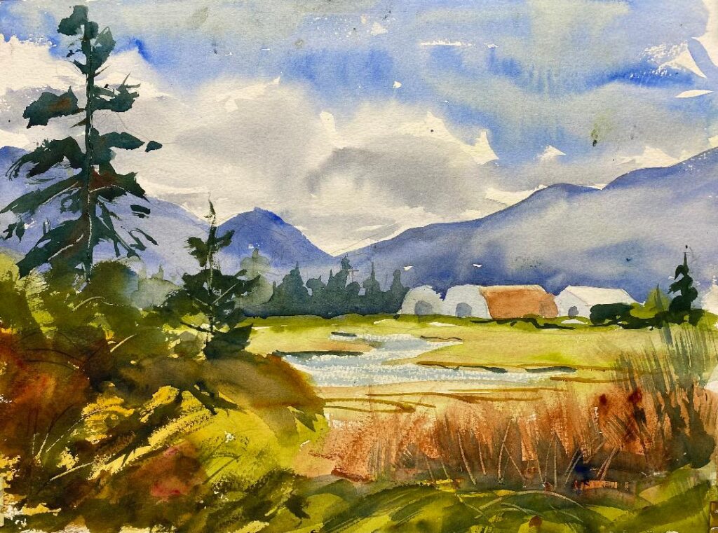
So when I painted the lovely barns of the Schmuck/Smith Dairy Farm near Sequim recently, I took a bold approach and painted the barns directly with yellow on my brush. I think it helped give a more spontaneous look to the painting. I then put some blue and some red on my brush with a dollop of water and painted the shadowed ends of the barns, leaving the sunny roofs and sides mostly white. I think the looseness of the paint strokes helped the overall effect.
(The date stamp in the upper right is a leftover from the Whidbey Plein Air Paintout. This is the back of one of the paintings from that event).